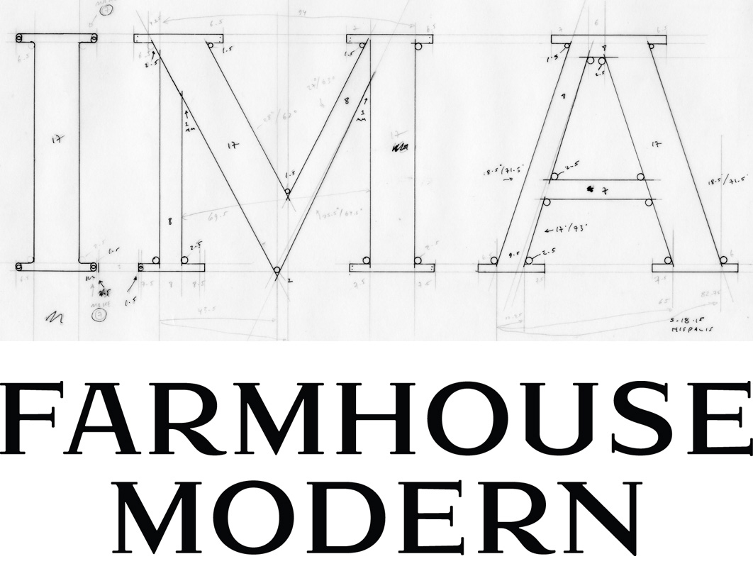
The wordmark we designed for Farmhouse Modern is based on the hot-metal typeface Hispalis Bold Titling. We don’t know who designed Hispalis or when it was originally released, but we assume it dates from the first half of the 20th century. Hispalis was issued by the Spanish foundry Nacional.
After inking several of the letters—the easier ones!—and rendering the forms in Adobe Illustrator, we worked with Rod Cavazos and his team at Psy/Ops to build out the final wordmark. Rod’s typographic expertise was much appreciated!
We think our revival of Hispalis embodies the dualities embodied by Farmhouse Modern: old vs. new, rural vs. urban, nature vs. design and, in some sense, female vs. male.