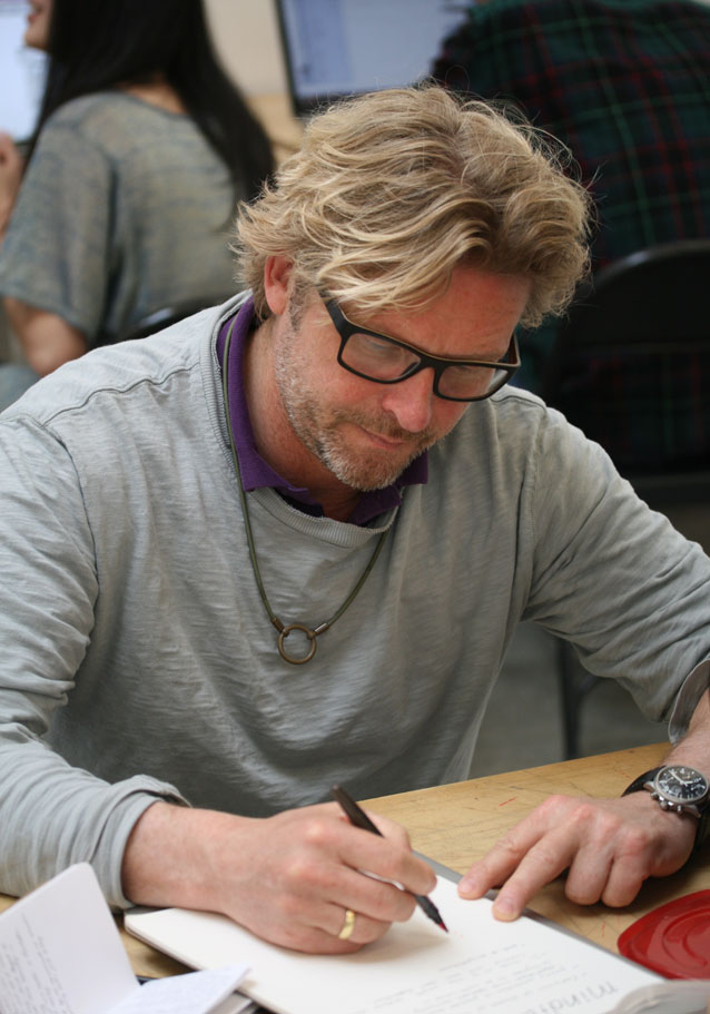
René at his Saturday workshop with CCA students, “The Architectural Letter.”
In town for the TYPO conference, we had the pleasure of bringing Dutch designer and typographer René Knip to California College of the Arts to give a lecture to CCA’s graphic design students and faculty. I had the honor of introducing René prior to his lecture; what follows are excerpts from my remarks:
René has a fierce love of typographic forms, and this love is most often expressed in a material—and spatial—context. In a 2011 interview, René said: “I use letters like a photographer does a camera: I use them to illustrate emotions.”
These emotions are evoked by a typography that is liberated from the page and screen and made manifest in the physical world. It joyfully inhabits this world, interacting with it: René’s letters move, cast shadows, get wet, and age. Whether formed of water cut steel, milled aluminum, sand-blasted stone, or ceramic tile, René consistently creates typography with a monumental presence that is nonetheless idiosyncratic and personal. His is a typography with a point of view.
René Knip studied graphic design at the Academy of Visual Arts St. Joost, Breda, where he worked under type designer Chris Brand, perhaps best known for the face Albertina. On graduation, Knip worked for three years as the assistant designer to Anthon Beeke. In 1992 he started his own studio, Atelier René Knip, or A.R.K.
In 2012 René launched the type foundry arktype.nl with Janno Hahn. Together they have released 25 typefaces specifically designed for use in architectural lettering and environmental graphics.
In an age in which graphic design is increasingly virtual and temporal, I take great pleasure in the work of a designer that is so concrete—and literally so. [MF]