Design is Play

  • Work
    • Systems
      • March Pantry
      • CCA DLS X
      • El Pípila
      • Oriel Wines
      • Touchstone Climbing
      • Helix RE
      • Exalt App
      • Intel AppUp
      • Extole
      • CCA Craft Forward
      • Anson Mills
      • Washoe Grill
      • The Buckeye
      • Unhelpful Instructions
      • Design is Play
    • Trademarks
    • Icons
    • Books
      • Symbols
      • Dirty Baby
      • Richter 858
    • Covers
    • Posters
    • Process
  • Play
    • PLOG
      • Recent Posts
      • Play : Work
      • Play : Press
      • Play : School
      • Agitprop
      • Symbols
      • Typography
      • Playmates
      • Favorites
      • Archive
    • Publications
      • Books
      • Articles
    • Press
      • Book Reviews
      • Interviews
    • Shop
  • Meet
    • About Us
    • Clients
    • Awards
    • Contact Us

21 March, 2011

MetalMark Naming and Identity

plog_21.03.11

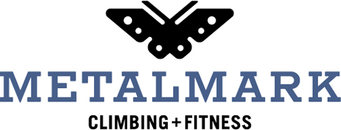
Touchstone Climbing is opening a gym in Fresno, California, and we were asked to develop its name and visual identity. We named the new gym MetalMark after a native California butterfly with distinctive, metallic markings. We were inspired by the simple idea of metamorphosis, by the physical and mental changes we undergo as rock climbers. The form of our butterfly symbol is transformed as well: it is modeled on the engineered aluminum cams used in outdoor rock climbing.

The MetalMark logotype is set in Rockwell Antique, a slab serif typeface issued in 1931. As a cast-metal typeface, we like the connection between the materiality of the original type (metal) and the name MetalMark. The typeface is not available commercially, so we redrew the letters by hand before creating the art digitally.

+ SHARE Tags Play : Work/Symbols/Typography

Older
Newer

©2025 Design is Play. All Rights Reserved.