Design is Play

  • Work
    • Systems
      • March Pantry
      • CCA DLS X
      • El Pípila
      • Oriel Wines
      • Touchstone Climbing
      • Helix RE
      • Exalt App
      • Intel AppUp
      • Extole
      • CCA Craft Forward
      • Anson Mills
      • Washoe Grill
      • The Buckeye
      • Unhelpful Instructions
      • Design is Play
    • Trademarks
    • Icons
    • Books
      • Symbols
      • Dirty Baby
      • Richter 858
    • Covers
    • Posters
    • Process
  • Play
    • PLOG
      • Recent Posts
      • Play : Work
      • Play : Press
      • Play : School
      • Agitprop
      • Symbols
      • Typography
      • Playmates
      • Favorites
      • Archive
    • Publications
      • Books
      • Articles
    • Press
      • Book Reviews
      • Interviews
    • Shop
  • Meet
    • About Us
    • Clients
    • Awards
    • Contact Us

5 November, 2018

Play Press: Fox and Wang interviewed by the Letterform Archive

We are delighted to be profiled in today’s blog post at the Letterform Archive. Florence Fu surveys our body of agitprop over the last 25 year—with an eye on our differences: So. Cal vs. Taipei; English vs. Mandarin; Bob Dylan vs. Janet Jackson.

Read the interview online at Letterform Archive News.

+ SHARE Tags Play : Press/Play : Work/PLOG/Symbols/Typography/Agitprop

19 October, 2018

Play Press: The “Design of Dissent” Poster Exhibition in Romania

Unirii Square in Timișoara, Romania

We are honored that our 2016 poster Trump 24K Gold-Plated is featured in Mirko Ilić’s Design of Dissent poster exhibition, which opened in Timișoara, Romania on October 19th.

From the exhibition statement: “The Design of Dissent is a survey of prominent graphic works of social and political protest and critique spanning the last fifty years, initiated by Milton Glaser and Mirko Ilić. The exhibition in Timișoara includes a selection of graphic works created by Atelier Nous Travaillons Ensemble (France), Péter Pócs (Hungary), Yossi Lemel (Israel), Cedomir Kostović (USA), Barbara Kruger (USA), Parisa Tashakori (Iran), Jose Luis Lopez (Ecuador), Coco Cerrella (Argentina), Vitaliy Shostya, Elena Batenko, Svetlana Koshkina, Marina Chikaliuk (Ukraine), Anur Hadžiomerspahić (Bosnia and Herzegovina), Chun-liang Leo Lin (Taiwan), Andrew Lewis (Canada), Natalia Delgado Avila (Mexico), Mohammad Sharaf (Kuwait), Chris Serrano (USA),  Ramzi Moutran, Sabia Fatayri, Christopher Hunt (USA), Yue Chen (USA), Mark Fox, Angie Wang (USA), Juan F. Miranda (Argentina), Bruno Rivera (Bolivia), Dalida Karić-Hadžiahmetović (Bosnia and Herzegovina), Wesam Mazhar Haddad (Jordan), Dugudus (France), Bukheyproject/Bulkin S., Mikheeva E. (Russia).”

See our Trump 24K Gold-Plated poster and others under Design is Play Studio Posters.

Photos: © 2018 Paula Duta.

+ SHARE Tags Play : Press/Symbols/Typography/Agitprop

25 August, 2018

Play Press: International “Tolerance” Poster Exhibition in Ukraine

Our work is included in Mirko Ilić’s “Tolerance” traveling poster show that opened at The MostFest 2.0 in Konstantinovka, Ukraine, on August 25th. (Mark’s poster can be seen in the lower left.) We love that the posters on this wall were placed to cover earlier neo-Nazi graffiti.

Other designers whose work is also on this wall include Garth Walker, Edel Rodriguez, Paula Scher, Milton Glaser, and Max Kisman.

See our “Tolerance” posters and others under Design is Play Studio Posters.

Photo courtesy of Rajko Božić.


+ SHARE Tags Play : Press/Symbols/Agitprop

14 May, 2018

International “Tolerance” Poster Exhibition

Earlier this year we were asked by Mirko Ilić to contribute to his “Tolerance” traveling poster exhibition, an international response by designers to the idea of social tolerance. Angie worked with noted calligrapher John Stevens to typographically interpret a quote of Martin Luther King Jr.’s included in his 1963 book of sermons, Strength to Love.

Mark’s poster superimposes one of his illustrations over a halftone image of Donald Trump and the White House.

We like Mirko’s thoughts on the political role of the designer, which he expressed in an interview with Print in 2017: “Designers are firstly humans/citizens and then designers. Hopefully, one day when they stop being designers, they’re still going to be humans…. Designers and artists understand the power of an image; because of that they have an additional duty to use it, but use it wisely.”

See other posters under Design is Play Studio Posters.

+ SHARE Tags Play : Press/Symbols/Typography/Agitprop

20 April, 2018

Play Press: “Protest! Resistance Posters” exhibition, Museum für Gestaltung Zürich

We are thrilled to have four of our posters—Trump (Moloch), OBOMBA, Trump 24K Gold-Plated, and Kinder, Gentler, Carpet Bombing—included in the exhibit “Protest! Resistance Posters” which opens tonight at the Museum für Gestaltung Zürich.

From the museum’s publicity: “Globalization, women’s rights, Trump: the poster has established itself as an effective medium for political struggle. 50 years after 1968, the onset of a worldwide rebellion, this exhibition presents around 300 international protest posters.

“The designs dismantle rulers, denounce injustice, or lend utopia a face. They are instances of visual memory, appeal to the necessity of resistance today, and prove the topicality and universality of the depicted themes. The exhibition showcases the work of socially engaged designers and illuminates various strategies of protest.”

+ SHARE Tags Play : Press/Play : Work/Symbols/Typography/Agitprop

28 March, 2018

Play Press: “Hope to Nope” exhibition, Design Museum, London

Photograph courtesy of Benjamin Westoby and the Design Museum.

Our Trump 24K Gold-Plated poster was acquired by the Design Museum, London on September 7, 2017 and is to appear in their new exhibition—“Hope to Nope: Graphics and Politics 2008–18”—which opens this week.

From the Design Museum publicity: “Graphic design in the form of internet memes, posters and protest placards is being used by the marginalised and powerful alike to shape political messages like never before.

“From the global financial crash and the Arab Spring, to ISIS, Brexit and Trump, this exhibition explores the numerous ways graphic messages have challenged, altered and influenced key political moments.”

See our Trump 24K Gold-Plated poster and others under Design is Play Studio Posters.

+ SHARE Tags Play : Press/Play : Work/Symbols/Typography/Agitprop

14 February, 2018

Play Press: Works on Paper Acquired by the Letterform Archive, Part 2

San Francisco’s Letterform Archive recently acquired a range of printed ephemera from the Design is Play and BlackDog archives. Stationery systems include those designed for the San Francisco Museum of Modern Art (SFMOMA) Architecture + Design Forum (1998); California College of the Arts (CCA) (2003); Design is Play (2008); and BlackDog (2008).

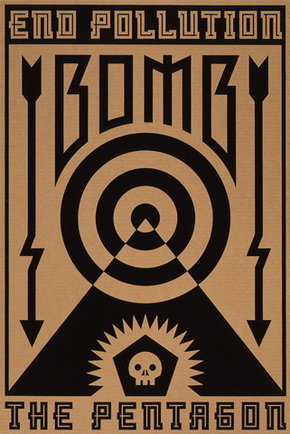
The most recently designed acquisition is the 6th Amendment poster we designed for the “We the People” exhibit held at The Cooper Union (2017); the oldest is Mark’s “End Pollution: Bomb the Pentagon” poster (1991). The body of work encompasses a range of printing processes on a wide variety of substrates, including offset lithography, engraving, letterpress, blind embossing, foil stamping, and screen printing.

One of the acquisitions is a full deck of playing cards we foil stamped to announce the launch of our original website in 2011. (The cards were used for a mailing based on the idea of “play.”) Card backs are overprinted with an LCD grid to suggest infinite possibilities: depending on which portions of the grid are “lit,” any letter or number can be constructed. The LCD grid as a programmable system is an apt analogy for our studio as well as the web.

Card fronts are overprinted with a “window” which reframes the original design, forcing the viewer to reconsider the familiar schema. Like the LCD grid, the window suggests a larger idea: a screen with an infinite number of views. Foil stamping by Oscar Printing, San Francisco; photography © Mark Serr.

+ SHARE Tags Play : Press/Play : Work/Symbols/Typography/Agitprop

18 January, 2018

Play Press: TDC Typography 38, Judges Choice

We are proud to have our Trump 24K Gold-Plated poster designated a “Judge’s Choice” by juror Spencer Charles. Below are his comments from Typography 38, the Annual of the Type Directors Club:

“The judging for this competition took place the weekend after the U.S. presidential inauguration, the same weekend the nation was dealing with the fallout from the immigration ban that had just been enacted. Because of this context, and because of the thoughtful execution of this poster, it provoked a conversation unlike any other entry in the competition. Additionally, it demonstrated that typography can (and should) extend beyond formal and aesthetic considerations and can very powerfully communicate the spirit of its content, even if that purpose is to agitate and make a political statement.”

See our Trump 24K Gold-Plated poster and others under Design is Play Studio Posters.

+ SHARE Tags Play : Press/Play : Work/Symbols/Typography/Agitprop

18 September, 2017

Play Press: “We the People” poster exhibition, The Cooper Union, NYC

We are one of ten U.S. design studios invited to interpret an amendment from the Bill of Rights. We were randomly assigned the Sixth Amendment—the right to a fair trial.

Organized by ThoughtMatter, Mirko Ilić, and The Constitutional Sources Project (ConSource), the exhibit is open to the public September 18-23 at The Cooper Union, NYC.

See our poster and others under Design is Play Studio Posters.

Handwriting: Mathieu Lommen
Photography: Mark Serr
Sculpture: One of two cast-concrete “Urns of Justice” at the U.S. Courthouse in Lafayette, Louisiana, by artist Diana Moore.
(Source image from the Carol M. Highsmith Archive, Library of Congress, Prints and Photographs Division.)


+ SHARE Tags Play : Press/Play : Work/Agitprop

7 September, 2017

Play Press: The Design of Dissent

(clockwise from top left) Trump 24K Gold-Plated, Republican Contract on America, howiloveya and Beware of God.

Milton Glaser and Mirko Ilić’s “Expanded Edition” of The Design of Dissent includes posters from Design is Play, BlackDog, and California College of the Arts!

We are honored that our 2016 poster Trump 24K Gold-Plated shares a spread with work from Barbara Kruger and Edel Rodriguez. Earlier BlackDog posters are also represented, including Republican Contract on America (1995), howiloveya (1998), and Beware of God (1992).

Student work from my CCA Graphic Design 1 classes includes posters by Dan Covert and Wishmini Perera. [MF]

See our Trump 24K Gold-Plated poster and others under Design is Play Studio Posters.

+ SHARE Tags Play : Press/Play : School/Play : Work/Symbols/Typography/Agitprop

10 April, 2017

Trump (Moloch) and the San Francisco March for Science

We are publishing a new poster—Trump (Moloch)—to protest the anti-scientific, anti-environmental policies of Donald Trump and the Republican party. We will be attending the San Francisco “March for Science” on April 22 with our posters held high.

The poster design is a variation of one I originally created for an international environmental poster exhibit in 1997. (See lower image.) The exhibit coincided with the Third Session of the United Nations Framework Convention on Climate Change held in Kyoto, Japan. (This session produced the Kyoto Protocol, an international treaty that committed signatories to reduce greenhouse gasses in an effort to slow the effects of climate change. Although the United States signed the Protocol under President Clinton, the Senate failed to ratify the treaty.)

The 1997 version of my poster is titled Capitalism Consuming His Children (Moloch). The image is inspired by Francisco Goya’s 1819–23 painting Saturn Devouring His Children, and depicts a disembodied, satanic head—Capitalism—gleefully eating a human while smoke billows from its stack. Moloch is the name of an ancient Canaanite god who was worshiped through human sacrifice—specifically, the immolation of children.

Less than 100 days in office, Donald Trump appears hell-bent on becoming the most pro-pollution, anti-environmental American president in half a century. From leasing federal lands to the coal industry, to dismantling clean water rules, to reducing fuel efficiency in cars and trucks, the Republicans will make America more toxic and all of our lives shorter, nastier, and more brutish. Twenty years after the Kyoto Protocol, Trump’s regressive war on the planet has made this new version of my old poster feel sadly appropriate.

Screen printed in gloss black on two fluorescent papers by John Sullivan at Logos Graphics in San Francisco. [MF]

+ SHARE Tags Play : Press/Symbols/PLOG/Agitprop

24 February, 2017

Play Press: Trump 24K Gold-Plated Acquired by Two European Museums

We are thrilled that our anti-Trump poster was acquired by both the Museum für Kunst und Gewerbe Hamburg and the Stedelijk Museum Amsterdam in February. These are the fourth and fifth European museums to add Trump 24K Gold-Plated to their design collections.

Still no word from any of the American curators we sent the poster to…

See Trump 24K Gold-Plated poster and others under Design is Play Studio Posters.

+ SHARE Tags Play : Press/Play : Work/Symbols/Typography/Agitprop

7 February, 2017

Play Press: Typography 38

Both Trump 14K Gold-Plated and Trump 24K Gold-Plated were selected for inclusion in the 2017 Annual of the Type Directors Club, Typography 38. (It was designated a “Judge’s Choice” by juror Spencer Charles.) In addition to being exhibited in New York City, our posters and the other winning entries will tour cities in the United States, Canada, China, England, France, Germany, Indonesia, Israel, Japan, Poland, Russia, South Korea, Spain, Taiwan, Thailand, and Vietnam.

See other posters under Design is Play Studio Posters.

+ SHARE Tags Play : Press/Play : School/Symbols/Typography/Agitprop

4 January, 2017

Play Press: Communication Arts 2017 Typography Annual

Thank you Communication Arts and the judges of the 7th Typography Annual for including our unauthorized Trump campaign poster for publication!

We created two versions of the Trump campaign poster, foil stamping the design in two different shades of gold. Both posters were then register embossed. Trump 24K Gold-Plated is one of 143 projects out of 1,839 entries that will appear in the January/February issue of Communication Arts.

See our Trump 24K Gold-Plated poster and others under Design is Play Studio Posters.

+ SHARE Tags Play : Press/Symbols/Typography/Agitprop

11 November, 2016

Play Press: Trump 24K Gold-Plated Acquired by Three European Museums

Prior to the election, we assumed that our Trump 24K Gold-Plated posters would be understood by now as a bullet the country collectively dodged. Unfortunately, we were wrong, and our work took on new meanings with Hillary Clinton’s loss on November 8.

We sent Trump 24K Gold-Plated to a number of curators around the world before the election, and are proud to announce that the poster has been acquired by the Museum für Gestaltung Zürich in Switzerland; the Poster Museum at Wilanów in Warsaw, Poland; and the Victoria and Albert Museum in London, England.

The poster has also been acquired by the Letterform Archive in San Francisco and the Center for the Study of Political Graphics (CSPG) in Los Angeles.

Read our original statement about the design of the poster—written before the election—here.

See our Trump 24K Gold-Plated poster and others under Design is Play Studio Posters.

+ SHARE Tags Play : Press/Play : Work/Symbols/Typography/Agitprop

12 September, 2016

Trump 24K Gold-Plated

Inspired by Jesse Reed and Michael Bierut’s design of an official H monogram for Hillary Clinton’s presidential campaign, we created an unauthorized campaign poster for Donald J. Trump. Whereas Hillary’s H pulls one’s eye to the letterform itself, the narrative implicit in our design requires the viewer’s gaze to oscillate between foreground and background; between typographic form and counter-form.

The form comprises four gold, rotating letter Ts which are emblematic of qualities projected by Donald Trump and largely accepted by his supporters: strength, success, wealth, and revolutionary (i.e. impolitic) speech. The counter-form suggests a conflicting narrative, however: namely, that Donald Trump’s disruptive and divisive rhetoric is creating metaphoric negative spaces in the fabric of American society. These spaces—fracture lines, really—snake through the design’s square silhouette to reveal a swastika. And while the swastika is historically a symbol of dynamism and cyclical renewal associated with the sun, in this context it simply evokes hate speech and nationalist demagoguery.

Let’s be clear: for some Americans, the attractive aspects of Donald Trump’s public persona can obscure his repellent views. The tension in our design between positive and negative space—between luxe gold foil letters and the matte black swastika—is meant to mirror this dualism, and it is a tension that makes some uncomfortable. “How do I know it’s anti-Trump?” one wary hipster asked when we offered him our poster in the Chrome store on Valencia Street in San Francisco’s Mission District.

We hung some of our posters along several blocks of the Mission District that Saturday afternoon. Did anyone notice? In his 1966 book I manifesti, Italian designer Attilio Rossi records that “The poster is an optic scandal. You don’t want to look at it yet you see it.” We know that our scandalous Trump posters were indeed seen; only hours later, even the tape that held them in place was gone.

See our Trump 14K Gold-Plated and Trump 24K Gold-Plated poster and others under Design is Play Studio Posters.

+ SHARE Tags Play : Work/Symbols/Typography/Agitprop

30 November, 2015

Fox/BlackDog Acquired by LACMA, Part 2

copyright_designisplay_plog_30_nov_2015

In addition to the work from Design is Play mentioned in our last plog, the Los Angeles County Museum of Art acquired seven of Mark’s agitprop screen printed posters designed when he worked under the name BlackDog.

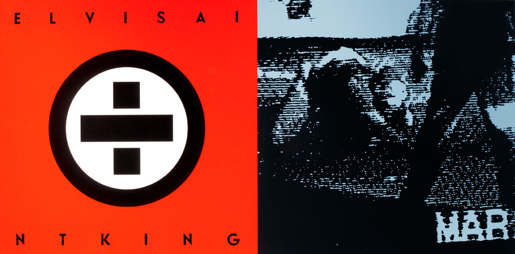
Works include “Elvis Ain’t King” (1992), about the Los Angeles Police Department Beating of Rodney King (above); “The Great Seal (after El Lissitsky)” (1998); “Cover Your Head” (1992); “howiloveya” (1998); “Tricky Ollie” (1998); “State of the Union (Where Friends Meet Friends)” (1998); and “End Pollution: Bomb the Pentagon” (1991). You can read about “End Pollution: Bomb the Pentagon” on our February 21, 2011 plog post.

See other agitprop posters at BlackDog.

+ SHARE Tags Play : Press/Play : Work/Symbols/Typography/Agitprop

9 March, 2015

Fox/BlackDog Acquired by LACMA

©DesignisPlay Mark Fox Posters

Two posters Mark designed in the 1990’s were recently acquired by the Los Angeles County Museum of Art as part of the Marc Treib Collection. Treib is professor emeritus of architecture at the University of California, Berkeley, and his gift of over 500 posters now forms part of the Decorative Arts and Design collection at LACMA.

“5ive Iconoclasts” (left) is an offset litho poster promoting a series of lectures from the same year. The 1995 AIGA/SFMOMA Design Lecture Series featured an eclectic mix of designers and artists which included Tibor Kalman (M&Co.), Vaughan Oliver (v23), the Guerrilla Girls, Jenny Holzer, and Diller + Scofidio. The poster quotes Russian poet Vladimir Mayakovsky: “Art is not a mirror to reflect the world, but a hammer with which to shape it.”

“Republican Contract on America” (right) is a 1995 propaganda poster screen printed on chipboard. A quote by Nazi Hermann Göring is used to highlight the anti-intellectual, anti-cultural stance of the Republican-controlled 104th U.S. Congress.

See other agitprop posters at BlackDog.

+ SHARE Tags Play : Press/Symbols/Agitprop

8 September, 2014

Fox at the Denver Art Museum

Kinder Gentler Carpet Bombing

One of my political posters, “Kinder, Gentler, Carpet Bombing,” is now on view in the exhibition “Drawn to Action: Posters from the AIGA Design Archives.” Culled from the AIGA Design Archives at the Denver Art Museum, the 33 posters in this exhibition “demonstrate the inventive techniques designers use to provoke action.”

I designed “Kinder, Gentler, Carpet Bombing” to question the first U.S./Iraq War in 1990, and distributed the poster via fax to a few friends and colleagues. I also hung it in the windows of my house, studio, and car. (The “GTO” designation in the lower right-hand corner is an abbreviation for Graphic Terrorist Organization, a name suggested by Seattle designer Art Chantry.) This poster is also in the collection of the United States Library of Congress, Prints and Photographs Division. [MF]

See other agitprop posters at BlackDog.

+ SHARE Tags Play : Press/Agitprop

21 February, 2011

20 Years Ago: Bomb the Pentagon

plog_21.02.11

For a 1991 AIGA San Francisco event, Steve Tolleson asked fifty Bay Area graphic designers to create posters addressing an environmental issue of their choice. My topic? The tendency of the US military to avoid environmental scrutiny—and, at times, responsibility—by invoking the so-called state secrets privilege. According to Project Censored, “the Department of Defense is the largest polluter in the world, producing more hazardous waste than the five largest US chemical companies combined. Depleted uranium, petroleum, oil, pesticides, defoliant agents such as Agent Orange, and lead, along with vast amounts of radiation from weaponry produced, tested, and used, are just some of the pollutants with which the US military is contaminating the environment.” The design parameters were tight: one color on a recycled stock at a size of 18 x 24. A number of the posters went on to win awards in national competitions, including my poster and those designed by Doug Akagi and Michael Schwab.

I hand-inked the arrows, target, and Bomb lettering, and built the constructivist-inspired typography with an early version of Adobe Illustrator. Final art was a black and white “stat” from which the printer shot a Kodalith film positive; he then screen printed the design using black enamel ink on corrugated cardboard. For any designer who remembers the prevalence of bright white, cast-coated papers such as Kromecote in the 1980s, printing “high end” work on an unbleached and uncoated substrate was unorthodox.

Twenty years later, given our post-Timothy McVeigh, post-9/11 mind-set, Bomb the Pentagon has become both visually and politically jarring: a year or so ago I watched a young museum curator’s body literally recoil from the poster. 1991 was a moment in American history that now seems strangely distant, when calls to bomb anything were rightly understood as hyperbole. Unlike much graphic design which is subject to visual trends, the “look” of this poster doesn’t appear dated, at least to my eyes; rather, it is the message—and its stridency—that dates the piece. [MF]

+ SHARE Tags Symbols/Typography/Agitprop

Tags

  • Recent Posts
  • Play : Work
  • Play : Press
  • Play : School
  • Agitprop
  • Symbols
  • Typography
  • Playmates
  • Favorites
  • Books
  • Book Reviews
  • Interviews
  • Articles
  • Archive
Newer

©2026 Design is Play. All Rights Reserved.