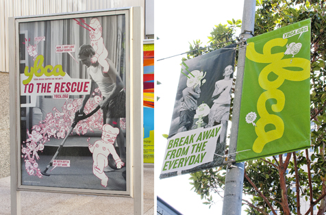
“Play manifests in many forms at Volume, but it’s most liberating when we forget the designer dogma and the ‘how design should be’ voice in our heads to produce work that surprises and scares us. It’s a rare occurrence—there are only so many people brave enough to, say, carve a poster into their chest, and I don’t consider myself one of them—but when it happens, I wonder why we can’t repeat the process for every project.
“In 2009, we were lucky enough create a new campaign and visual system for Yerba Buena Center for the Arts (YBCA). YBCA is an organization that prides itself on bucking the status quo and we thought we were doing the same in our initial design explorations. We certainly avoided the stately, clean patina that characterizes so many art institutions, but none truly had the edge YBCA demanded. We were hung up on what cutting-edge design should look like instead of truly infusing the work with the subversive voice YBCA desired.

“We had one idea, though, that did evoke this renegade spirit—and we almost didn’t show it. Would you share an idea that has a cartoon monster straight out of Sponge Bob Square Pants or Futurama lopping off the upper torso of 1950’s-era astronaut? This was late-night comic relief between our serious, heavy-hitter directions. Better to include it, though, to show YBCA we understood them and were willing to get a little crazy. There’s no way they’d pick this direction, right?

“Well, of course they picked it. They loved it. The idea was so dead-on and engaging to them that it transcended its middling execution. Once we got over the shock of YBCA’s selection and began refining, palpable excitement began to overcome us, too. The project felt a bit dangerous and we were giddily nervous on the eve of its public rollout. Swimming in our heads were past remarks from peers deriding humor as a cheap, lowbrow design tactic. Yet here we were, commissioning goofy drawings of Mao and Mr. T superimposed over banal stock photographs while talking about ‘setting one’s life to vibrate.’ We had absolute confidence that the design captured the essence of YBCA, but we sensed that there would be no middle ground responses—people would either love it or hate it.


“Interestingly, most non-designers we talked to loved it. The YBCA leadership also unapologetically loved it, even if it’s doubtful their whole staff did. (Who are more serious than design types? Art types.) The designer breakdown was fifty-fifty. Only a few disparaged it outright to our faces, but many were conspicuously quiet. The most unexpected praise came from the Apple store employee who sold me an iPhone and, upon seeing my email address and recognizing the domain from our design credit, gushed how the Third Street wall was his new favorite landmark on his walk to work.
“How often does a good cross-section of the public see, let alone care—let alone react—to what we as designers make? That was the real thrill of this project. Play, then, is also sitting outside at the SFMOMA cafe as YBCA’s upstart wall taunts the more august institution across the street. Play is watching my friends’ kids marvel giddily at the outsized illustrations looming over them. Play is a ‘Set Your Life to Vibrate’ banner coincidentally installed right above Good Vibrations on Valencia Street. Really.”
Eric Heiman is a San Francisco designer and educator, and works with his partner Adam Brodsley at Volume, Inc. We invited Eric to share a moment of play with us.