Design is Play

  • Work
    • Systems
      • March Pantry
      • CCA DLS X
      • El Pípila
      • Oriel Wines
      • Touchstone Climbing
      • Helix RE
      • Exalt App
      • Intel AppUp
      • Extole
      • CCA Craft Forward
      • Anson Mills
      • Washoe Grill
      • The Buckeye
      • Unhelpful Instructions
      • Design is Play
    • Trademarks
    • Icons
    • Books
      • Symbols
      • Dirty Baby
      • Richter 858
    • Covers
    • Posters
    • Process
  • Play
    • PLOG
      • Recent Posts
      • Play : Work
      • Play : Press
      • Play : School
      • Agitprop
      • Symbols
      • Typography
      • Playmates
      • Favorites
      • Archive
    • Publications
      • Books
      • Articles
    • Press
      • Book Reviews
      • Interviews
    • Shop
  • Meet
    • About Us
    • Clients
    • Awards
    • Contact Us

21 March, 2011

MetalMark Naming and Identity

plog_21.03.11

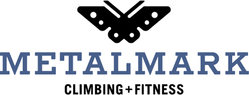
Touchstone Climbing is opening a gym in Fresno, California, and we were asked to develop its name and visual identity. We named the new gym MetalMark after a native California butterfly with distinctive, metallic markings. We were inspired by the simple idea of metamorphosis, by the physical and mental changes we undergo as rock climbers. The form of our butterfly symbol is transformed as well: it is modeled on the engineered aluminum cams used in outdoor rock climbing.

The MetalMark logotype is set in Rockwell Antique, a slab serif typeface issued in 1931. As a cast-metal typeface, we like the connection between the materiality of the original type (metal) and the name MetalMark. The typeface is not available commercially, so we redrew the letters by hand before creating the art digitally.

+ SHARE Tags Play : Work/Symbols/Typography

14 March, 2011

Play at the Pasadena Museum of California Art

plog_14.03.11

Curator Amos Klausner charged twenty-six designers with re-imagining one letter from the alphabet, using the illegibility and deconstructive nature of graffiti as their starting point. (We chose the letter A.) The ensuing exhibition, Getting Upper, will open at the Pasadena Museum of California Art on May 15, 2011.

Our lowercase letter a is derived from Albrecht Dürer’s schema for blackletter construction published in 1538. Dürer’s line drawing breaks down the letter into component parts to reveal its design. We subvert this intent by reversing the diagram, flipping the negative spaces to positive ones. The resulting segments are then printed in a palette of modulated colors that further fragment (and deconstruct) the constructed letter. Our poster layout utilizes Jan Tschichold’s non-arbitrary page proportioning system to suggest a book page with the image area as the text block.

Each of the twenty-six letters will be published as a screen printed poster by Bloom Screen Printing Co. and made available for sale at the museum and online.

See more examples of our poster designs under Design is Play Studio Posters.

+ SHARE Tags Play : Press/Play : Work/Typography

21 February, 2011

20 Years Ago: Bomb the Pentagon

plog_21.02.11

For a 1991 AIGA San Francisco event, Steve Tolleson asked fifty Bay Area graphic designers to create posters addressing an environmental issue of their choice. My topic? The tendency of the US military to avoid environmental scrutiny—and, at times, responsibility—by invoking the so-called state secrets privilege. According to Project Censored, “the Department of Defense is the largest polluter in the world, producing more hazardous waste than the five largest US chemical companies combined. Depleted uranium, petroleum, oil, pesticides, defoliant agents such as Agent Orange, and lead, along with vast amounts of radiation from weaponry produced, tested, and used, are just some of the pollutants with which the US military is contaminating the environment.” The design parameters were tight: one color on a recycled stock at a size of 18 x 24. A number of the posters went on to win awards in national competitions, including my poster and those designed by Doug Akagi and Michael Schwab.

I hand-inked the arrows, target, and Bomb lettering, and built the constructivist-inspired typography with an early version of Adobe Illustrator. Final art was a black and white “stat” from which the printer shot a Kodalith film positive; he then screen printed the design using black enamel ink on corrugated cardboard. For any designer who remembers the prevalence of bright white, cast-coated papers such as Kromecote in the 1980s, printing “high end” work on an unbleached and uncoated substrate was unorthodox.

Twenty years later, given our post-Timothy McVeigh, post-9/11 mind-set, Bomb the Pentagon has become both visually and politically jarring: a year or so ago I watched a young museum curator’s body literally recoil from the poster. 1991 was a moment in American history that now seems strangely distant, when calls to bomb anything were rightly understood as hyperbole. Unlike much graphic design which is subject to visual trends, the “look” of this poster doesn’t appear dated, at least to my eyes; rather, it is the message—and its stridency—that dates the piece. [MF]

+ SHARE Tags Symbols/Typography/Agitprop

14 February, 2011

Emily McVarish at Play

plog_14.02.11

“A Thousand Several is a letterpress book which I wrote and produced for Granary Books and exhibited at 871 Fine Arts last fall. My plan had been to design A Thousand Several as I went along, printing one element and then responding to that element with a new compositional layer. I had thought this would be a liberating exercise, an alternative to the master planning that books tend to demand, a way to make the most of workshop epiphanies.

“In fact, the process often proved fraught, as I attempted to build a graphic system in the dark. ‘What sort of constraints will I be setting myself if I add this?,’ I kept asking myself, ‘How will the dynamics I’ve established be affected by another component?’ I muddled through, and after a year of printing I had my book. I also had a pile of make-ready sheets and a list of design ideas that had not made it through the gauntlet of unknowns that riddled each stage of A Thousand Several’s production.

“One of those ideas finally led me to play: Using a tabbed die, I cut my make-ready into strips of variable widths that could be combined in more than one way to add up to a standard size. I laid all of the strips out on my work table and set about composing Piece-time, an edition of 50 modular collages. Lifting strips from among hundreds of visible variations, laying them alongside each other, sliding them into different arrangements, I felt like I was playing an instrument. Improvisation came easily. Rhythm more than judgment drove and decided the composition of each print.”

Emily McVarish is a San Francisco writer, designer, book artist, and educator. We invited her to share a moment of play with us.


+ SHARE Tags Playmates

7 February, 2011

dress code at Play

plog_07.02.11

“Our company began out of a shared love for music. We started by collaborating on screen printed posters and package designs for our friends’ bands in college. These jobs never really paid much, if anything, and were more for the fun of making.

“As our business and client list grew, we sadly had less and less time to devote to these projects. Without this creative outlet though, our other work began to get a bit stale.

“To combat the seriousness of corporate clients we started to create a series of one-color screen printed posters to advertise our lectures. We pay to have them printed out-of-pocket, so we have complete creative control. Without the constraints of client approval, the posters have become a way for us to play and experiment.”

Andre Andreev and Dan Covert are New York designers and CCA alumni. We invited them to share a moment of play with us.

+ SHARE Tags Playmates

2 February, 2011

Play at Play

plog_02.02.11

To announce the launch of the Design is Play website, we created a mailing based on the idea of play. Playing card backs are overprinted with an LCD grid to suggest infinite possibilities: depending on which portions of the grid are “lit,” any letter or number can be constructed. The LCD grid as a programmable system is an apt analogy for our studio as well as the web.

Card fronts are overprinted with a “window” which both frames and reframes the original design, forcing the viewer to reconsider the familiar schema. Like the LCD grid, the window suggests a larger idea: a screen with an infinite number of views. The playing cards were foil stamped by Oscar Printing, San Francisco. (Photos by Mark Serr.)

See more playing cards under Design is Play Studio Systems.

+ SHARE Tags Play : Work/Typography

31 January, 2011

Fox on Designers and Books

plog_31.01.11

Launching February 1, Designers and Books is a new website “devoted to publishing lists of books that esteemed members of the design community identify as personally important, meaningful, and formative—books that have shaped their values, their worldview, and their ideas about design.” The site is launching with 678 books recommended by 50 designers; Mark is honored to be among them. His book list includes titles about typography, symbols, comics, and social critique. (Illustration by Ben Shahn from Ounce, Dice, Trice.)

Designers and Books was created by Steve Kroeter who also acts as its Editor-in-Chief. The site was designed by Pentagram.

+ SHARE Tags Favorites

24 January, 2011

Minniti McMurtrie Identity

plog_24.01.11

We designed this identity for San Francisco fashion designer Jennifer Minniti and architect Darren McMurtrie. The letterforms are modeled on Banjo, a titling face released by the French foundry Deberny & Peignot in 1930. The wide versions of the letters provide cues to the pronunciation of their names as they roughly correspond to the stresses. (For example, the first R is held longer than the second R in McMurtrie.)

See more examples of our identity designs under Design is Play Studio Trademarks.

+ SHARE Tags Play : Work/Symbols/Typography

5 January, 2011

CCA Craft Forward Symposium 2011 Identity

plog_05.01.11

Craft Forward is a forthcoming symposium at California College of the Arts that will explore the boundaries between craft, art, design, architecture, and writing. We were engaged to create the identity for the symposium and to design its promotional materials.

Our solution juxtaposes two square glyphs: a circa 1909 typographer’s ornament (symbolizing craft), and a QR code (symbolizing forward). The QR (or Quick Response) code can be scanned with a smart phone which then directs the user to the Craft Forward website. In this context the QR code functions as a modern ornament, but one with embedded content.

See the Craft Forward identity applied to a foil stamped postcard under Design is Play Studio Systems. (More applications to come….)

+ SHARE Tags Play : Work/Symbols

3 January, 2011

Play Press: Communication Arts 2011 Typography Annual

plog_03.01.11

We are pleased to announce that our studio website—yes, the one you are currently viewing!—as well as our 2010 New Year Card and Anson Mills Packaging System are featured in Communication Arts 2011 Typography Annual. Of the 2,135 competition entries, 179 were selected for publication by the jury.

+ SHARE Tags Play : Press

1 January, 2011

Man Ee Wong: As It Is Written: Project 304,805

poster_manee

For my Fall, 2010 Graphic Design 1 class at CCA, student Man Ee Wong designed this museum exhibit poster based on a show at the Contemporary Jewish Museum in San Francisco. As It Is Written: Project 304,805 is an exhibition featuring a specially trained scribe who writes the entire text of the Torah over the course of one year. The completed Torah is in the form of a scroll, and is comprised of 62 connected sheets on which are written 10,416 lines of text and 304,805 individual letters.

To design her poster Man Ee photographed a Torah at Congregation B’nai Emunah in San Francisco. (Thank you, Rabbi Melamut!) Man Ee is especially interested in the scroll’s physical seams, what might be thought of as the document’s “connective tissue.” As a result, her photograph is cropped to highlight a seam which bisects the poster on the right. Using a negative of the photographic image adds drama and challenges our preconceptions about how a Torah should be presented. In brief, she makes the Torah “new.”

Concurrent with her efforts in my class, Man Ee worked with Angie in Typography 1 and it is clear to me that the finished poster is a synthesis of Man Ee’s learning experiences in both classes. Man Ee recreates Theo Van Doesburg’s experimental alphabet of 1919 for the exhibition text and sets it in a justified block to echo the Torah’s justified columns of text. Van Doesburg’s letterforms provide a contrasting voice to the Hebrew: geometric versus organic; modern versus ancient; minimal versus complex. The placement of the colorful text block, bridging one of the Torah’s seams, suggests both reinforcement—a strengthening of tradition—as well as continuity. The Torah will live as long as it is read, and written. [MF]

See more examples of student poster design under Design is Play Classroom Posters.

+ SHARE Tags Play : School/Typography

27 December, 2010

Play Press: 50 Books/50 Covers of 2010

plog_27.12.10

Our design for the art book Dirty Baby is included in the AIGA exhibition “50 Books / 50 Covers of 2010.” The national competition features the best-designed books of the year, and we are happy to be among the winners. Dirty Baby showcases the paintings of American artist Ed Ruscha.

See several spreads from the project under Design is Play Studio Systems Dirty Baby.

+ SHARE Tags Play : Press

20 December, 2010

Happy Holidays from our Junior Design Team!

plog_13.12.10

Lukas (6), Cate (9), and Elias (11) show off their kerning. Pax is Latin for peace.

+ SHARE Tags Typography/Favorites

8 November, 2010

Advice for Designers, Extrapolated

plog_08.11.10

Marcel Duchamp wrote, “as a painter it was much better to be influenced by a writer than by another painter,” the idea being that one should look outside of one’s creative profession for inspiration to avoid direct emulation. It is in this spirit that I enjoy considering the practice of graphic design through the lenses of other creative practices, in particular the craft of writing.

We are fans of Roald Dahl in the Fox & Wang abode, and have read a number of his books to our (collective) three children. Not long ago we read Dahl’s 1977 memoir “Lucky Break—How I Became a Writer” for the first time. On the second page he offers seven tips to would-be fiction writers that, perhaps not surprisingly, are relevant to would-be graphic designers.

Number one on that list: You should have a lively imagination.

One immediately thinks: Isn’t this obvious, for fiction writers as well as graphic designers? (Perhaps Dahl thought so, because this is the only piece of advice he doesn’t elaborate on.) After a moment, though, I have to ask: What does it mean to “have a lively imagination,” anyway?

Marcel Proust observed that “The essence of the writer’s task is the perception of connections among unlike things.” Whether writing or designing, I believe it is through seeing, through forming surprising or illuminating linkages, that one puts a lively imagination to work. It is being, in a word, playful.

A later book-length piece of advice, Anne Lamott’s Bird by Bird: Some Instructions on Writing and Life (1994) contains a number of insightful suggestions for graphic designers thinly veiled as advice to writers. In the chapters “Shitty First Drafts” and “Perfectionism,” Lamott explores the messy process of writing and the creative dangers of not allowing that process to be messy. She warns that “Perfectionism will ruin your writing, blocking inventiveness and playfulness.” And: “Tidiness makes me think of held breath, of suspended animation, while writing [read: design] needs to breathe and move.”

It is interesting to weigh Lamott’s point of view against Roald Dahl’s, especially because his fourth tip—You must be a perfectionist—appears antithetical to hers. In truth, though, I think this particular issue is more about timing, about when to seek perfection in one’s craft rather than whether to seek it at all. Lamott allows for more detours along the way, I suspect, but both she and Dahl are intent on arriving at the same destination sooner or later. [MF]

+ SHARE Tags Favorites

1 November, 2010

Michael Schwab at Play

plog_01.11.10

“David Sedaris’ agent called me with a request. Because David has never been comfortable with the publicity photos for his book tours and speaking engagements, he wanted me to create a logo he could use in lieu of a head shot. His concept was clear and succinct: ‘A monkey reading a book.’

“I immediately began studying monkeys—the way they sit, the way they hold objects, their tails, their postures. The David Sedaris Monkey is a simple, bold, graphic icon of which I’m proud. The process was fun and, like a good book, I didn’t want it to end. David likes it, too.”

Michael Schwab is a Bay Area illustrator and designer. We invited him to share a moment of play with us.

+ SHARE Tags Symbols/Playmates

25 October, 2010

Dennis Crowe at Play

Dennis Crowe’s “Top of the Hour” :20 Spot for MTV (3:00)
The original 1994 spot and the process of making it.

“When I consider the concept of play as it relates to the many projects I have designed throughout my career, one project in particular leaps out: the ‘Top of the Hour’ spot I designed and directed for MTV. Although this project is many years old and long gone from the airwaves, with play as the theme I couldn’t resist dusting this one off from the archives.

“I immediately knew I wanted to use a clock as the central theme and play with the idea of using the numbers on the clock as letterforms to spell out the MTV tag line ‘Plug In.’ I soon realized that by using the M from the MTV logo as the 3 on the clock I could bookend the spot with this visual trick.

“The fact that the spot was going to be broadcast repeatedly every hour on the hour gave me the excuse to overload it with visual activity so that jaded channel surfers would not get bored with multiple viewings. It became an opportunity to play with the collective attention span of a generation.

“Inspired by the dark, dreamlike, imaginative art of Mark Ryden and with trademark ‘blendo’ animation style in mind, I developed the storyboards. With the support of the fantastic production, animation, and technical crew at Colossal, we combined replacement animation, stop motion animation, live action, and archival footage into a frenetically paced explosion of imagery. Colossal Pictures’ Jenny Head, the world-class producer, made sure that I got everything I wanted including a circus performer, a rocket ship, and live animals. It took us 60 days to craft the :20 spot. I never played so hard at work in my life.”

Director: Dennis Crowe; Production Company: Colossal Pictures; Producer: Jenny Head; Technical Director: Peter Williams; Animator: Trey Thomas; Director of Photography: Don Smith; Set Design Elements: John Pappas; Set Production: Jamie Hyneman.

Dennis Crowe is a Bay Area designer and educator. We invited him to share a moment of play with us.

+ SHARE Tags Playmates

18 October, 2010

Steve Lyons at Play

plog_18.10.10

“For this net neutrality mark I made for CREDO Action, I was attempting to take a geeky tech policy issue and make it playful. The essential idea behind net neutrality is one of keeping the internet open and free from corporate control. (For more on the topic I suggest you visit Save The Internet). How better to convey freedom than to give the internet some wings? Lightning bolts add a little zap to the composition and complete the labor union retro feel. CREDO took the playfulness a little farther and made temporary tattoos as a giveaway at the progressive blogger conference Netroots Nation.”

Steve Lyons is Design Director of CREDO Mobile. We invited him to share a moment of play with us.

+ SHARE Tags Symbols/Playmates

11 October, 2010

Play at Carbon Five, 10.06.2010

plog_11.10.10

In October we were invited to present our work to Carbon Five, an agile software development company. Our presentation was notably analog, and involved a number of small scraps of paper. (Yes, we still use paper at Play!) Our design of an identity for the startup BO.LT provided a vehicle for us to discuss our process of form development and refinement.

Our preferred method of creating imagery is to draw by hand—without the “aid” of computer software. We find this allows us great freedom and, surprisingly, speed. Repeatedly drawing the same forms also forces us to look at those forms closely—to become conscious of their physical qualities in relation to each other. After creating a rough sketch we like, we make a tight inking of it using a Rapidograph technical pen. (You can see one of our BO.LT icon inkings above.)

As Angie notes, “the computer shouldn’t dictate our manner of thinking and working, nor should it displace our ability to pick up a pen and make marks on paper.” Although we use the computer to generate final art in a digital format, we relish the opportunity to work by hand in the earlier stages of our projects.

+ SHARE Tags Play : Work/Symbols

7 September, 2010

Vivienne Flesher at Play

plog_07.09.10

“We had two weeks in Round Hill, a lavish and historic resort in Jamaica. While there I tried drawing and painting, but in the heat and humidity both seemed slow and complicated. On the third day I came across the fallen leaves of a Trumpet Tree. To me they resembled dresses by Issey Miyake, tossed in a heap. Over the rest of the vacation I photographed them hundreds of times. They were intrinsically elegant; shooting them the simplest way worked best.”

Vivienne Flesher is a San Francisco artist. We invited her to share a moment of play with us.

+ SHARE Tags Playmates

6 September, 2010

Ward Schumaker at Play

plog_06.09.10

“While creating a piece of calligraphy for Afar Magazine, I’d cut a mask out of cardboard for the Swedish word lagom (meaning just enough, the opposite of excessive and extravagant), intending to use the mask as part of an elaborate Photoshop file combined with other images. When I turned to sweep the scraps from the floor, however, the afternoon sun was shining on them and they looked so genuine and honest, and somehow so appropriate, that I straightened them and photographed them just like that, and that’s how the piece appeared in the magazine. Very lagom.”

Ward Schumaker is a San Francisco artist. We invited him to share a moment of play with us.

+ SHARE Tags Typography/Playmates

Tags

  • Recent Posts
  • Play : Work
  • Play : Press
  • Play : School
  • Agitprop
  • Symbols
  • Typography
  • Playmates
  • Favorites
  • Books
  • Book Reviews
  • Interviews
  • Articles
  • Archive
Older
Newer

©2026 Design is Play. All Rights Reserved.