Design is Play

  • Work
    • Systems
      • March Pantry
      • CCA DLS X
      • El Pípila
      • Oriel Wines
      • Touchstone Climbing
      • Helix RE
      • Exalt App
      • Intel AppUp
      • Extole
      • CCA Craft Forward
      • Anson Mills
      • Washoe Grill
      • The Buckeye
      • Unhelpful Instructions
      • Design is Play
    • Trademarks
    • Icons
    • Books
      • Symbols
      • Dirty Baby
      • Richter 858
    • Covers
    • Posters
    • Process
  • Play
    • PLOG
      • Recent Posts
      • Play : Work
      • Play : Press
      • Play : School
      • Agitprop
      • Symbols
      • Typography
      • Playmates
      • Favorites
      • Archive
    • Publications
      • Books
      • Articles
    • Press
      • Book Reviews
      • Interviews
    • Shop
  • Meet
    • About Us
    • Clients
    • Awards
    • Contact Us

29 October, 2012

Dogpatch Boulders Identity

plog_29.10.12 Dogpatch Boulders Identity

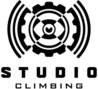
Touchstone Climbing is at it again, this time adding a new bouldering gym in the Dogpatch section of San Francisco, south of downtown. Slated to open in early 2013, the gym will feature prefabricated walls manufactured by the Bulgarian company Walltopia.

Our design is a conceptual no-brainer: dog + “eyepatch” = dogpatch. The colored X behind the dog was created with climbing tape, and reinforces the cruciform design of the dog’s face. Touchstone wanted the new identity to feel “urban.”

See other trademarks we have designed for similar clients under Design is Play Studio Symbols Trademarks Sports and Entertainment.

+ SHARE Tags Play : Work/Symbols

30 July, 2012

Play Press: Graphis New Talent 2012

GD1posterFinal

We are always thrilled when our students’ work from CCA is honored by inclusion in an international competition. The recent Graphis New Talent annual features the work of four students from Mark’s “Graphic Design 1: Foundation” class: Amy Compeau, Kelly Kusumoto, Vincent Romero, and May Wong.

One of the winning projects is pictured above: May Wong’s poster for an exhibition of Richard Avedon’s work. According to May, the aesthetic of her poster is “inspired by Avedon’s minimalist black and white portraits. The lens from a Rolleiflex camera becomes a representation of his incisive eye for photography and how he captures his subject’s personality from a different perspective.” We must note that May shot her own photography for this poster, one of the parameters of the assignment.

CCA colleagues Bob Aufuldish and Alysha Naples also had student work selected for publication, and we congratulate them and their students for this honor.

See more examples of student poster design under Design is Play Classroom Posters.

+ SHARE Tags Play : Press/Play : School

28 May, 2012

Yosei Shibata and Shoshi Kanokohata at Play

SONY DSC

Your stories determine your life. Integrity defines your stories.

“Deeply moved by this quote, we empathize with it and believe that it is our mission as an artist/designer to send products with a story to the world.

“We handmade 15 bowls of the same design and shipped them to various countries. Our recipient: Yves Klein. An iconic figure in French monochronism, Klein patented the color ‘International Klein Blue’ with which he attempted to visualize the invisible. The bowls sent to Klein, now deceased, traveled to countries such as Turkey, Japan, Egypt, and Brazil. They returned to us as invalid mail. One box came back strewn with rough scribbles, while another came back wrapped over with foreign postal tape. After three months, only six returned. The damaged boxes reflected rough travels across borders. Out of the six bowls, five were broken; only one came back intact.

“Our project utilizes a traditional Japanese technique called Kintsugi. Kitusgi is one of the oldest recycling practices, whereby cracked ceramic objects are pieced together using lacquer and gold. Not only utilized for repair, the addition of gold streaks accentuates the aesthetic value of the object.

“Instead of traditional gold, we used the original ‘International Klein Blue’ pigment to revive the bowls returned to us. The blue cracks and the damaged boxes recount the unique stories of each bowl’s long journey to and from their country.”

Yosei Shibata is a Los Angeles designer and a CCA alumnus. Shoshi Kanokohata is a Los Angeles ceramic artist. We invited them to share a moment of play with us.

+ SHARE Tags Playmates

23 April, 2012

March Pantry Identity and Packaging System Application

March Pantry

We recently completed a section on our site featuring our identity and packaging system for March Pantry. Hearth and home are central to the store’s concept, and the shop stocks seasonal jams made especially for March by LouLou’s Garden, select spices from Le Sanctuaire, pots and pans from Brooklyn Copper Cookware, and handmade butcher block tables from Union Studio.

Our hand-lettered wordmark is printed and embossed on die cut labels with a laid finish; it is screen printed when applied to apothecary jars. The design is understated but invitational. (So far the system has won awards for typography from both Communication Arts and the Type Directors Club.) Photographer Kirk Amyx documented the work.

See our work to date for March Pantry under Design is Play Studio Systems.

+ SHARE Tags Play : Work/Typography

5 March, 2012

Play Press: Graphis Logo 8

plog_05.03.12

Four mongrams and one icon system we created are included in the new logo design anthology curated by Graphis. Included are symbols for BlackDog, CCA’s Graphic Design BBQ, Four Barrel Coffee, and Group MB, as well as a system of icons we designed for Wired Magazine’s iPad app. The BlackDog monogram is a Platinum award winner, one of only ten.

The work of a number of our CCA colleagues is included in Graphis Logo Design 8 as well, including symbols designed by Jennifer Jerde and Scott Hesselink of Elixir Design, Christopher Simmons of Mine, and Michael Vanderbyl of Vanderbyl Design. This volume also features an interview with our friend—and Mark’s “boss” in 1985—Michael Schwab. Michael is one of the few designers we know of who still uses a Koh-I-Noor Rapidograph inking pen in the development of his final art.

See more examples of our trademark designs under Design is Play Studio Symbols.

+ SHARE Tags Play : Press/Symbols/Typography

6 February, 2012

Bob Aufuldish at Play No. 2

plog_06.02.12

“In 1987 when my wife Kathy Warinner and I moved from Ohio to San Francisco, we took the southern route across the country—it was, after all, February. One evening last November I was curious what the northern route would be so I used Google Maps to follow the freeways across the country as a way of reenacting the trip. In our 1987 trip we tried as much as possible to stay off the interstates so when I was conducting my virtual reenactment I did the same. And I came across a place called Little America in Wyoming. Fascinated, I took a photo of it off my screen and started looking for more interesting places. Solitude, Mt. Olympus, Nixon, and Last Chance followed and I was hooked.

“For the past few years I’ve designed new years announcements for the landscape architects SWA Group and for their 2012 announcement I pitched the idea of evocative place names. These are juxtaposed with landscapes of various kinds—the desert, mountains, agriculture, and the sprawl of cities and suburbs. All photographed off my monitor, visited without leaving my office.

“It was a great project. I even found a place in West Virginia called Bob.”

Bob Aufuldish is a Bay Area designer and educator. We invited him to share another moment of play with us.

+ SHARE Tags Playmates

9 January, 2012

Play Press: Communication Arts 2012 Typography Annual

plog_09.01.12

We are pleased to note that our March Pantry Packaging System is featured in Communication Arts 2012 Typography Annual. Of the 1,723 competition entries, 150 were selected for publication by the jury.

Check back soon for the complete March Pantry project in our Studio Systems section.

+ SHARE Tags Play : Press/Typography

28 December, 2011

Typography Sketchbooks

Typography Sketchbooks Heller
DOWNLOAD
“Mark Fox”
by Steven Heller and Lita Talarico
Typography Sketchbooks
Princeton Architectural Press, 2011

+ SHARE Tags Interviews

26 December, 2011

Happy Holidays from our Junior Design Team!

plog_26.12.11

Cate (10), Elias (12), and Lukas (7) contemplating Jan Tschichold’s non-arbitrary page proportioning system at SolBar in Calistoga on Christmas.

+ SHARE Tags Favorites

5 December, 2011

Play Press: 2011 Print Regional Design Annual

plog_05.12.11

The Far West category in Print’s 31st Regional Design Annual was judged by Brigitta Bungard, Assistant Creative Director in the Museum of Modern Art’s Department of Advertising and Graphic Design. Fortunately for us, Brigitta responded to work that she believed demonstrated “a sense of craft,” and she chose three of our pieces to represent our region: an elephant icon we created for BO.LT, the CCA CraftForward symposium announcement, and our own announcement for the Design is Play website launch.

We were also quoted in the issue. In case you missed it:

Q: What visual stereotype would you eliminate from the Bay Area?

A: San Francisco, like any urban American center, is rife with folks who excel at using software to alter and recombine found images. Our culture would be richer without the ensuing visual mash-ups. They are ultimately cannibalistic. As instructors, we insist that our students create all of the imagery they work with in our classes. They shoot their own photographs, generate their own drawings, and hand-ink their symbols. We want our students to become designers who will elevate the visual culture.

We are pleased to note that a number of our CCA colleagues are also represented in the Far West category: Christopher Simmons of Mine, Michael Vanderbyl of Vanderbyl Design, and Cinthia Wen of Noon. Sputnik, CCA’s in-house undergraduate graphic design studio, is honored as well.

See the BO.LT icon under Design is Play Studio Symbols; the CCA CraftForward symposium announcement under Design is Play Studio Systems; and the Design is Play website announcement under Design is Play Studio Systems.

+ SHARE Tags Play : Press

21 November, 2011

Studio Climbing Identity

plog_21.11.11

Touchstone Climbing is opening yet another gym, this time in downtown San Jose, California. Located in a former movie theater called Studio, the building features a classic 1950 channel lettering neon sign. As part of our visual research, we took photographs of the signage while atop an electric scissor lift 30 feet above the street so we could capture the images without distortion. These photographs ultimately became the basis of hand-inked studies with which we created custom lettering.

The eye and gear symbol we designed references the history of the building as a theater, and is inspired by ideas of projection and seeing. The art was meticulously crafted to optically pulsate: it both radiates outward as it simultaneously contracts inward to the center. Noted speed climber Hans Florine summarizes the new Studio identity on Facebook with the phrase “I got my eye on your gear.”

+ SHARE Tags Play : Work/Symbols/Typography

14 November, 2011

Play at RE:DESIGN / Creative Directors, 11.07.2011 (part 2)

plog_14.11.11

“There is ecstasy in paying attention.” —Anne Lamott

Some of the interrelated themes we explored at the RE:DESIGN / Creative Directors conference earlier this month were notions of detail, craft, and tempo. In both our studio practice as well as in our classes at California College of the Arts, we strive to create and foster work that is the result of disciplined focus. Angie’s class, in particular, stresses attention to typographic detail.

In the act of reading, all of us are accustomed to seeing letters (and words) as discrete units of meaning; as a result, we are unaccustomed to paying attention to the nuanced details of individual letterforms. (And for good reason! Paying attention to these details impedes the process of reading.) Angie’s second assignment requires her students to create abstract compositions with the dissected forms and counterforms of letter anatomy. The nature of the assignment leads her students to focus on the very details of letterform design that are typically overlooked. These small, revelatory moments of seeing—fulfillments of Josef Albers’ teaching dictum “I want the eyes to open”—are essential to the development of any competent designer.

The images above show Jeff Lin at work and a finished composition by Constance Smith, two students in Angie’s Fall, 2011 class. See more examples of abstract typographic compositions under Design is Play Classroom Letters.

+ SHARE Tags Play : Press/Play : School/Typography

7 November, 2011

March Trunk Show Invitation

plog_07.11.11

Our friends at March asked us to design an invitation to a trunk show of apparel conceived by interior designer Sam Hamilton of March and textile and clothing designer Matt Dick of Mato Creative. Inspired by a mid-century photograph of a newspaper seller wearing a white paper apron with oversize headlines (i.e. “Football Results”), the invitation is screen printed on Tyvek. Matt transformed the flat piece into an apron by adding metal grommets and cotton ties, and then folding it.

Our original intention was to hand set the invitation text with xeroxes of hot metal type from an old Linotype specimen book, pasting it up one letter at a time. As sometimes happens, though, March fell in love with Angie’s rough sketch, and this became the basis of the final art. (The rough sketch is 3 1/2 inches wide—we enlarged it 1000% to the final width of 35 inches.) We like the contrast between the warmth and imprecision of Angie’s hand-traced type and the machined quality of Tyvek.

+ SHARE Tags Play : Work/Typography

24 October, 2011

Play Press: Typography Sketchbooks

Design is Play - Typography Sketchbooks Heller

We are pleased to be among the designers whose work is featured in Steven Heller’slatest book published by Princeton Architectural Press. Co-authored with Lita Talarico,Typography Sketchbooks reproduces the private sketchbook pages and working drawings of more than ninety of the world’s leading designers and typographers, including our CCA colleagues Bob Aufuldish of Aufuldish & Warinner, and Rod Cavazos of PsyOps.

Erratum department: Angie’s typographic explorations of the Design is Play identity are included in Typography Sketchbooks as well, but she is unfortunately not credited. The iterations of play generated by slicing up xeroxed copies of 15th century blackletters are hers…

+ SHARE Tags Play : Press/Typography

26 September, 2011

Play at RE:DESIGN / Creative Directors, 11.07.2011

plog_26.09.11

We have been invited to speak at the RE:DESIGN / Creative Directors Conference in Palm Springs this November. The conference will open with a keynote conversation with Paula Scher; other presenters include a number of our friends and colleagues from California College of the Arts in San Francisco. The topic of our conversation will be “Get Back: Working Analog in a Digital World.” Don’t forget to bring pens and paper!

+ SHARE Tags Play : Press/Play : Work

19 September, 2011

March Pantry Identity and Packaging System

MFox_ 068

We recently designed an identity and packaging system for March Pantry in San Francisco, a new venture from retail store March. Mark created the original identity for March in 2003, one year after Tobias Frere-Jones’ Gotham became available to the public. Eight years later, Gotham has become so ubiquitous as to be invisible; as a result, we needed to create an identity for March Pantry that related to March’s use of Gotham Light, but that varied enough to be distinctive.

The ensuing type treatment is built on Gotham’s bones, but it deviates in significant ways. Foremost among the changes: we eliminated variations in stroke weight, redrawing the letters as monoline forms. In addition, we gave the leg of the R a modest lilt, and we rounded all of the external corners and terminals to soften the typographic “voice.” Finally, the implied geometry (and symmetry) of the original are fully realized: the letter C is based on a perfect circle, and the M is absolutely symmetrical. The net effect, in some sense, is to “de-design” the face, returning it to its vernacular roots. At least that’s how we think of it.

The tactility of embossed lettering on the printed label—as well as Angie’s handwriting—provides a warm contrast to the set type. Offset lithography and registered embossing by Oscar Printing; photography by Kirk Amyx. We will show more applications in due course….

+ SHARE Tags Play : Work/Typography

5 September, 2011

Play Press: Communication Arts 2011 Design Annual

plog_05.09.11

Following a win in Communication Art’s Typography Annual earlier this year, our Anson Mills Packaging System is currently featured in CA’s 52nd Design Annual. Of the 4,291 competition entries, 174 were selected for publication by the jury. (That’s 4% of the entries for those of you who don’t want to do the math!)

We are currently working on Anson Mills’ site redesign. Look for the launch sometime in 2012.

+ SHARE Tags Play : Press

29 August, 2011

New Work: Cengage Learning Book Covers

plog_29.08.11

We recently updated the section on our site featuring textbook covers we designed for Cengage Learning. Covers in this genre tend toward the literal, and rely heavily on stock photography. We aim to be metaphorical in our design approach, and to author our own images whenever possible. Each cover in this section features original photography, iconography, or typography.

See more examples of recent cover designs for Cengage Learning under Design is Play Studio Covers.

+ SHARE Tags Play : Work/Typography

30 May, 2011

CCA Craft Forward Symposium 2011 Applications

plog_30.05.11

We recently completed a section on our site featuring applications of the Craft Forward identity. To create variation within the system, we utilized a range of reproduction methods. We combined foil stamping, letterpress printing, offset lithography on a web press, laser printing, and screen printing with a mix of substrates, including chipboard, newsprint, DayGlo paper, and cotton organza. Photographer Mark Serr documented the work for us.

See the complete Craft Forward project under Design is Play Studio Systems.

+ SHARE Tags Play : Work/Symbols

28 March, 2011

Greg Clarke at Play

plog_28.03.11

“Each year, I’m asked by editor/designer Monte Beauchamp to create a sequential comic for BLAB, his idiosyncratic paean to the graphically unorthodox. He’s been curating these anthologies more or less every year since 1986, and I’ve had the honor of contributing since 2000. It’s a welcome respite from my usual grind of editorial illustration. I’m given only a general theme and 2–4 pages to write and draw whatever I want. No sketches, no revisions, no committee approvals—just a deadline to deliver finished art.

“This year’s theme is ‘the hereafter.’ I wanted to create a character who is skeptical of the notion of an afterlife, yet amuses himself by imagining he is receiving signs from the dead. The title is Dispatches From Oblivion. This issue of BLAB (newly rechristenedBLAB WORLD and now printing in hardcover) will be published this Fall by Last Gasp/San Francisco.”

Greg Clarke is a Southern California illustrator and recovering graphic designer. We invited him to share a moment of play with us.

+ SHARE Tags Playmates

Tags

  • Recent Posts
  • Play : Work
  • Play : Press
  • Play : School
  • Agitprop
  • Symbols
  • Typography
  • Playmates
  • Favorites
  • Books
  • Book Reviews
  • Interviews
  • Articles
  • Archive
Older
Newer

©2026 Design is Play. All Rights Reserved.