Design is Play

  • Work
    • Systems
      • March Pantry
      • CCA DLS X
      • El Pípila
      • Oriel Wines
      • Touchstone Climbing
      • Helix RE
      • Exalt App
      • Intel AppUp
      • Extole
      • CCA Craft Forward
      • Anson Mills
      • Washoe Grill
      • The Buckeye
      • Unhelpful Instructions
      • Design is Play
    • Trademarks
    • Icons
    • Books
      • Symbols
      • Dirty Baby
      • Richter 858
    • Covers
    • Posters
    • Process
  • Play
    • PLOG
      • Recent Posts
      • Play : Work
      • Play : Press
      • Play : School
      • Agitprop
      • Symbols
      • Typography
      • Playmates
      • Favorites
      • Archive
    • Publications
      • Books
      • Articles
    • Press
      • Book Reviews
      • Interviews
    • Shop
  • Meet
    • About Us
    • Clients
    • Awards
    • Contact Us

6 January, 2019

Play Press: Fox and Wang Off Duty

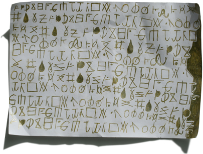
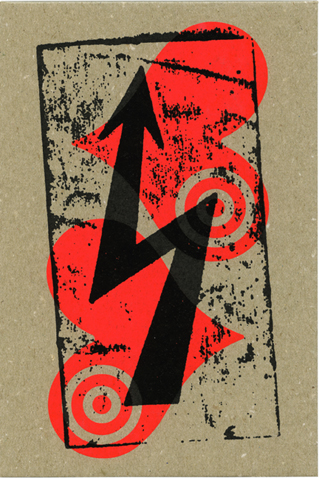
One of six assemblage paintings from the series “Unhelpful Instructions”

“Off-Duty” is a modest show of our work that includes assemblage paintings and limited-edition prints—work that we make in our off-hours, when we don’t have to be clear—or helpful.

On exhibit at The Bench Gallery from January 6 to February 16.

See all six assemblage paintings from the series “Unhelpful Instructions” under Design is Play Studio Systems.

+ SHARE Tags Play : Press/Play : Work/Favorites

4 November, 2016

Symbols: A Handbook for Seeing


PREVIEW OR PURCHASE

“Symbols: A Handbook for Seeing”
by Mark Fox and Angie Wang
The Monacelli Press, 2016

+ SHARE Tags Books/Play : Work/Symbols/Favorites

22 September, 2016

Play Press: Our New Book!

designisplay_26_sep_2016

We are pleased to announce that The Monacelli Press is releasing our book Symbols: A Handbook for Seeing on November 8, 2016. This richly illustrated anthology includes more than 400 examples of ancient and contemporary art and design in a range of media, including architecture, film, industrial design, graphic design, illustration, and photography. Symbols documents and celebrates the many ways in which designers and artists have chosen to express symbolic ideas visually.

As graphic designers and instructors at California College of the Arts in San Francisco, we bring an informed, curatorial eye to the book’s content. British artist and craftsman William Morris implored the public to “Have nothing in your houses that you do not know to be useful, or believe to be beautiful.” If the book is understood as a kind of house, then we furnished Symbols: A Handbook for Seeing with useful and beautiful ideas and images.

Preview or pre-order from:
Amazon
Barnes and Noble

Also available from:
Kinokuniya in San Francisco
McNally Jackson in New York City
Museum of Contemporary Art Chicago Store

+ SHARE Tags Play : Press/Play : Work/Symbols/Favorites

25 July, 2016

BlackDog: Seven Woes (or why work is hell)

copyright_designisplay_plog_25_jul_2016

The theme of the 1989 AIGA Design Conference held in San Antonio, Texas, was “Dangerous Ideas.” As a mere conference attendee, Seven Woes was my attempt to share some dangerous design ideas with my fellow attendees. Cheaply xeroxed, I handed out the postcard-sized list randomly while awaiting the first speaker one morning.

The Seven Woes are:

1
The designer who said: “I don’t need problems from some illustrator.”

2
The client who said: “I love what you’ve done, but did you have any other ideas?”

3
The art director who said: “Move to New York and I’ll use you.”

4
The designer who said: “This is far too sophisticated. Remember, your audience bowls.”

5
The client who said: “This won’t work at all; there aren’t any clichés.”

6
The designer who said: “We’re not creating art here—this is a business.”

7
The client who said: “I’m sorry, but we can’t use it; one of the women on the board thinks it looks like a penis.”

All of the quotes on the card are real, and were directed to me. (The art director in quote no. 3 is none other than Steven Heller.) The variation of the BlackDog logo was drawn by Gary Baseman. (MF)

+ SHARE Tags Play : Work/PLOG/Favorites

19 January, 2015

Judd Foundation, 101 Spring Street

©DesignisPlay

We were fortunate to be in New York in January where we visited the Judd Foundation in SoHo for the first time. The five-story cast-iron building was purchased by Donald Judd in 1968 as a home, studio, and permanent installation. The ground floor features a 1986 minimalist installation by Carl Andre titled Manifest Destiny which consists of eight stacked bricks, all bearing the legend “Empire.”

The third floor of the building houses Judd’s former studio which was perhaps our favorite space. The studio is comprised of three separate areas for activities that correspond to three distinct body positions: chairs for reading while sitting; a desk for drawing while standing; and a floor rug and wooden headrest for contemplation while recumbent.

Judd’s reductive arrangement of space within the studio and his prescription for a specific, different physical orientation while engaged in each task would no doubt serve to focus his attention and separate each creative endeavor in his consciousness. Daniel J. Boorstin, the author of The Image: a Guide to Pseudo Events in America, warns against the unconscious blurring of experience. Addressing technology and the “rise of images” in particular, he writes: “In twentieth-century America we have gone one step beyond the homogenizing of experience…. Even as we try to sharpen our artificial distinctions they become ever more blurry.”

Milton Glaser notes that “Drawing is thinking,” an observation I am fond of quoting. That said, the experience of being in Donald Judd’s studio leads me to an oppositional thought, which is: reading is not drawing is not thinking. While I still subscribe to Glaser’s dictum, I admire Judd’s implicit acknowledgment that while these three activities are related, they are not equivalent. The discipline (and clarity) demanded by Judd’s approach is revelatory. [MF]

+ SHARE Tags Favorites

15 December, 2014

Odile Redon’s The Birth of Venus

The Birth of Venus

While researching the symbolism of the shell for our (ongoing!) book project, we stumbled on an intriguing visual juxtaposition we thought we would share.

The goddess of love emerges from a seashell in The Birth of Venus by French painter Odilon Redon, c. 1912. Originating in the ocean, the shell shares water’s associations with creation and procreation, genetrix and matrix. Combined with physical characteristics which can suggest female genitalia, the shell is an emblem of fecundity and life and, by extension, felicity and prosperity.

Redon’s rendering of the shell’s elliptical silhouette and luminous interior creates a nimbus-like effect similar to the mandorla found in religious icons of the Virgin Mary or the Christ. (The lunate rim of the shell also echoes the crescent moon on which the Virgin often sits or stands.) The detail on the left is from a 13th century Byzantine manuscript in the collection of the J. Paul Getty Museum, Los Angeles.

Like the early Christian almond-shaped aureole, Redon’s seashell is maternal womb, life, light, and utterly sacred. [MF]

+ SHARE Tags Play : Work/Symbols/Favorites

14 April, 2014

René Knip at CCA, 4.10.2014

plog_14_APR_2014

René at his Saturday workshop with CCA students, “The Architectural Letter.”

In town for the TYPO conference, we had the pleasure of bringing Dutch designer and typographer René Knip to California College of the Arts to give a lecture to CCA’s graphic design students and faculty. I had the honor of introducing René prior to his lecture; what follows are excerpts from my remarks:

René has a fierce love of typographic forms, and this love is most often expressed in a material—and spatial—context. In a 2011 interview, René said: “I use letters like a photographer does a camera: I use them to illustrate emotions.”

These emotions are evoked by a typography that is liberated from the page and screen and made manifest in the physical world. It joyfully inhabits this world, interacting with it: René’s letters move, cast shadows, get wet, and age. Whether formed of water cut steel, milled aluminum, sand-blasted stone, or ceramic tile, René consistently creates typography with a monumental presence that is nonetheless idiosyncratic and personal. His is a typography with a point of view.

René Knip studied graphic design at the Academy of Visual Arts St. Joost, Breda, where he worked under type designer Chris Brand, perhaps best known for the face Albertina. On graduation, Knip worked for three years as the assistant designer to Anthon Beeke. In 1992 he started his own studio, Atelier René Knip, or A.R.K.

In 2012 René launched the type foundry arktype.nl with Janno Hahn. Together they have released 25 typefaces specifically designed for use in architectural lettering and environmental graphics.

In an age in which graphic design is increasingly virtual and temporal, I take great pleasure in the work of a designer that is so concrete—and literally so. [MF]

+ SHARE Tags Play : School/Typography/Favorites

24 March, 2014

Ray Bradbury, Jaron Lanier, and “The Digital Flattening of Expression”

plog_24_MAR_ 2014

A short piece Mark wrote—“Ray Bradbury, Jaron Lanier, and ‘The Digital Flattening of Expression’”—was recently published on the site Designers & Books. It explores thematic connections between Fahrenheit 451 and You Are Not a Gadget, in particular ideas about originality and authorship.

Mark also updated his book list on the site, adding new recommendations such as Tools of the Imagination: Drawing Tools and Technologies from the Eighteenth Century to the Present by Susan C. Piedmont-Palladino. Each book recommendations is accompanied by a brief “review” of sorts.

+ SHARE Tags Favorites

10 February, 2014

Play at Play: Happy Chinese New Year!

plog_10_FEB_2014

 Why, sometimes I’ve believed as many as six impossible things before breakfast. —The White Queen to Alice

We are committed fans of the impossible here at Design is Play. In fact, our very existence as print designers in twenty-first century San Francisco seems dubious at times, but we intend to thrive here nonetheless. For those of you whose Chinese is a little rusty, the character in the upper-right corner of our card reads wealth. We wish our friends and colleagues much success in this New Year, regardless of the persistence of the “Print is Dead” crowd.

As with our 2013 Valentine, our New Year card was screen printed by Kevin Giffen at Wranch Studio in Santa Monica, California. Kevin printed the design in three colors: two metallics and a black on a ridiculously heavy chipboard stock. Angie set the Lewis Carroll passage on the back of the card in Marian 1742, a monoline slab serif and close relative of Marian Black, the face we used for our Valentine.

+ SHARE Tags Play : Work/Favorites

1 July, 2013

In Memorium: Irving Oaklander, 1924–2012

(left) Irving Oaklander, proprietor of Oaklander Books in New York City, on December 23, 2010. Irving holds a rare copy of Vladimir Mayakovsky’s 1923 book For the Voice (Dlia Golosa) which was designed by El Lissitsky. (right) Angie holds a page of For the Voice up to the light to reveal the compositional correspondence between pages 17 and 18.

(left) Irving Oaklander, proprietor of Oaklander Books in New York City, on December 23, 2010. Irving holds a rare copy of Vladimir Mayakovsky’s 1923 book “For the Voice” (Dlia Golosa) which was designed by El Lissitsky. (right) Angie holds a page of “For the Voice” up to the light to reveal the compositional correspondence between pages 17 and 18.

Irving was curious and notably generous—two qualities that made him a natural teacher. (Not surprisingly, Irving taught in New York City’s public schools for many years before opening Oaklander Books.) Angie and I were fortunate to spend long hours on two separate occasions in his crowded Chelsea shop poring over his singular collection of design and typography books. Not only did Irving let us handle Mayakovsky’s For the Voice, but also, memorably, one of the Million Mark banknotes designed by Herbert Bayer in 1923.

Although Irving died one year ago this August, Angie and I think of him frequently, especially when Angie brings our type specimens to school to share with her students. Among the letterpress specimen books we bought from Irving are those for Trump-Deutsch (1938) designed by Georg Trump and released by H. Berthold, AG; Ingeborg Antiqua (c. 1909) designed by Professor F.W. Kleukens and released by D. Stempel, AG; and Ehmcke-Mediaeval (1924) designed by F.H. Ehmcke and released by D. Stempel, AG.

(left) A page from the Trump-Deutsch specimen book. (right) The title page from the Ingeborg Antiqua specimen book.

(left) A page from the Trump-Deutsch specimen book. (right) The title page from the Ingeborg Antiqua specimen book.

Steven Heller, who also frequented Oaklander Books, wrote a remembrance of Irving for Print Magazine in August of 2012 which can be read here. Swann Galleries in New York auctioned off some of Irving’s rare books in May of 2013, many of which can be seen in the auction catalog. Incidentally, Irving’s copy of For the Voice sold for $7,500. [MF]

+ SHARE Tags Typography/Favorites

1 April, 2013

Cate and Lukas at Play: Puffoglyphs

A complete showing of the Puffoglyphs by Lukas, 2012.

A complete showing of the Puffoglyphs by Lukas, 2012.

Cate’s drawing examining the relationship between the “sacred” glyphs O, P and Q, 2012.

Cate’s drawing examining the relationship between the “sacred” glyphs O, P and Q, 2012.

Each of the twenty-six upper- and lowercase letters in our alphabet has a distinct structure, but all are comprised of only four elemental strokes: vertical, horizontal, diagonal, and curvilinear.

It was the Greeks who created this system of standardization approximately 3,500 years ago. In addition to imposing geometric order on the irregular letterforms they adopted from the Phoenicians, the Greeks established the use of a baseline and uniform letterspacing. (It would be another two millennia before the Frankish king Charlemagne mandated the adoption of three additional guidelines still in use today: ascenders, descenders, and a common x-height.)

As a natural extension of their play, our children Cate (age 11) and Lukas (age 8) created a code for their own use they call the Puffoglyphs. They intuitively broke down the Latin alphabet into its four stroke variants and then recombined the component parts to create new, “encoded” typographic forms.

“Elementary letterforms and signs composed of vertical, horizontal, slanted and curvilinear strokes.” Detail from Typography: Formation + Transformation by Willi Kunz.

“Elementary letterforms and signs composed of vertical, horizontal, slanted and curvilinear strokes.” Detail from Typography: Formation + Transformation by Willi Kunz.


American designer Willi Kunz explores the four elemental strokes in his 2003 Typography: Formation + Transformation. Of the illustration we feature from his book, Kunz notes that “Even though the individual forms are abstract, the forms begin to suggest a typographic composition.” The dynamic that Kunz articulates, Cate and Lukas experienced through an act of play. [AW]

+ SHARE Tags Typography/Favorites

11 March, 2013

Angie at Play

Angie Wang’s photographs (1:25)
Amsterdam, Paris, and St. Petersburg, 2004–2007.

Beauty is now underfoot wherever we take the trouble to look. —John Cage

Prior to a trip to Paris in 2004, Mark asked me to return with responses to the following prompts:
The best visual contrast;
The most beautiful piece of type;
The most lush color combination;
The most memorable bite (flavor);
A fifth sensation of note.

These images are the result of what has become an ongoing exercise in my paying attention. Whether with photographs, sketches, or journal entries, I’ve learned to document my travels in an active way because it heightens my awareness of what I see and experience.

Mark and I incorporated a version of this exercise into our 2007 summer study abroad class in Amsterdam. As we stated in our syllabus, “The act of seeing is made more acute by the act of recording.” [AW]

+ SHARE Tags Play : School/Typography/Favorites

4 March, 2013

Design School Wisdom

Our friend and colleague Brooke Johnson from Chronicle Books in San Francisco is working on a new title with Jennifer Tolo Pierce called Design School Wisdom, a compilation of quotes from teachers and students. Brooke asked us to submit some quotes for possible inclusion in the book which we share below.

(left) Jeff Wasserman outside his studio in Santa Monica, 2009. (right) Mark Fox photographed by Michael Schwab for one of Michael’s posters, 1986.

(left) Jeff Wasserman outside his studio in Santa Monica, 2009. (right) Mark Fox photographed by Michael Schwab for one of Michael’s posters, 1986.

Being self-taught as a designer, I didn’t attend design school. I did, however, work at a few jobs during and after college that exposed me to some workplace wisdom.

One of my jobs in college—around 1982—was to work for Wasserman Silk Screen Co. in Santa Monica, California. Jeff Wasserman set up the original screen printing shop at Gemini G.E.L. in Los Angeles, and has printed for a number of well-known artists, including Andy Warhol, Ed Ruscha, Robert Rauschenberg, Claus Oldenberg, Frank Stella, and Billy Al Bengston, among others. His work is extremely precise, and he is a master at what he does. Nonetheless, one of the maxims Jeff often uttered to me was, “Don’t make a religious experience out of it.”

A few years later, in 1985, I worked for the designer and illustrator Michael Schwab in San Francisco who is especially well-regarded for his poster work. Michael has always been successful—or so it seemed to me!—and his oft-repeated advice usually followed negotiations with clients. He would say, “There’s always more time and more money.”

This is my twentieth year teaching courses in graphic design at California College of the Arts in San Francisco. I give my students no end of advice, I’m sure, but the one question I continually ask them that seems worth sharing is this: “Where does your eye go?” If you know where the eye goes when you look at work, and why, then you understand true hierarchy—regardless of the design intention. If you remain unaware of hierarchy, of what the eye sees and in what order, your work will remain indistinct and forgettable. [MF]

(left) Michael Manwaring photographed by Christopher Manwaring. (right) Angie at the RE:DESIGN / Creative Directors Conference in Palm Springs, 2011. The title of our presentation was “Get Back: Working Analog in a Digital World.”

(left) Michael Manwaring photographed by Christopher Manwaring. (right) Angie at the RE:DESIGN / Creative Directors Conference in Palm Springs, 2011. The title of our presentation was “Get Back: Working Analog in a Digital World.”

If you have to ask the question, you already know the answer. —Michael Manwaring

Michael Manwaring was my Graphic Design 2 instructor at the California College of Arts and Crafts in San Francisco. Michael’s pedagogic model seemed to be based on questioning—he deliberately responded to our questions with more questions. While this resulted in a dialogue of evaluation, it didn’t necessary yield a definitive answer—at least not immediately.

Needless to say it was maddening at the time. Ultimately, though, I learned from Michael how to actively—and critically—distill my ideas and formulate my opinions.

Work hard—the rest will come in time. —Steve Reoutt

I entered the CCAC graphic design program in 1993 and had the good fortune of having Steve Reoutt as one of my first instructors. For Steve, the discipline of working steadily and making progress every day was more important than the “success” of our final work. Steve made us sketch in large pads of newsprint every day, whether we felt like it or not. At the end of every assignment he would take the time to meet with us individually to go through our newsprint pad.

Final crits were led by students: we would put our work up and the students would choose which pieces to critique. More often than not my work would be the last to be chosen for discussion—or sometimes, not at all—leaving Steve to monologue about my project. He always managed to tease out some positive aspect (like the thoughtfulness of my approach) despite the awkward final form.

During one of his reviews of my sketch pad he looked at me and said, “You’re a good problem solver and you work hard. I know form-making doesn’t come easily for you, but no one has it all. Work hard, and the rest will come in time.”

His faith—and the rigor of his approach—had a profound impact on me as a student. It encouraged me to be patient and it allowed me to grow as a designer at my own pace. I have been teaching Typography 1 in the graphic design program at CCA for seven years now and, like Steve, I collect and review my students’ process sketches at the end of every assignment. [AW]

+ SHARE Tags Play : School/Favorites

14 February, 2013

Play at Play: Happy Valentine’s Day!

Love

If love was a train I’d throw my body right down on her tracks. —Michelle Shocked

Our most recent labor of love features two hearts with targets juxtaposed with a bolt. We drew the heart glyph; the bolt was lifted from a warning sticker marking high voltage on a Canadian ferry. As we love ink on paper, we screen printed our design on hefty chipboard to render the ephemeral greeting a bit less so.

Kevin Giffen from Wranch Studio in Santa Monica, California, printed the art: two hits (wet on wet) of fluorescent pink followed by one hit of black. Mark worked with Kevin at Wasserman Silk Screen Co. thirty years ago, and we are thrilled to be working with him again. Angie set the Michelle Shocked lyric on the back of the card in Marian Black, a monoline blackletter that we customized for readibility.

+ SHARE Tags Play : Work/Symbols/Favorites

26 December, 2011

Happy Holidays from our Junior Design Team!

plog_26.12.11

Cate (10), Elias (12), and Lukas (7) contemplating Jan Tschichold’s non-arbitrary page proportioning system at SolBar in Calistoga on Christmas.

+ SHARE Tags Favorites

31 January, 2011

Fox on Designers and Books

plog_31.01.11

Launching February 1, Designers and Books is a new website “devoted to publishing lists of books that esteemed members of the design community identify as personally important, meaningful, and formative—books that have shaped their values, their worldview, and their ideas about design.” The site is launching with 678 books recommended by 50 designers; Mark is honored to be among them. His book list includes titles about typography, symbols, comics, and social critique. (Illustration by Ben Shahn from Ounce, Dice, Trice.)

Designers and Books was created by Steve Kroeter who also acts as its Editor-in-Chief. The site was designed by Pentagram.

+ SHARE Tags Favorites

20 December, 2010

Happy Holidays from our Junior Design Team!

plog_13.12.10

Lukas (6), Cate (9), and Elias (11) show off their kerning. Pax is Latin for peace.

+ SHARE Tags Typography/Favorites

8 November, 2010

Advice for Designers, Extrapolated

plog_08.11.10

Marcel Duchamp wrote, “as a painter it was much better to be influenced by a writer than by another painter,” the idea being that one should look outside of one’s creative profession for inspiration to avoid direct emulation. It is in this spirit that I enjoy considering the practice of graphic design through the lenses of other creative practices, in particular the craft of writing.

We are fans of Roald Dahl in the Fox & Wang abode, and have read a number of his books to our (collective) three children. Not long ago we read Dahl’s 1977 memoir “Lucky Break—How I Became a Writer” for the first time. On the second page he offers seven tips to would-be fiction writers that, perhaps not surprisingly, are relevant to would-be graphic designers.

Number one on that list: You should have a lively imagination.

One immediately thinks: Isn’t this obvious, for fiction writers as well as graphic designers? (Perhaps Dahl thought so, because this is the only piece of advice he doesn’t elaborate on.) After a moment, though, I have to ask: What does it mean to “have a lively imagination,” anyway?

Marcel Proust observed that “The essence of the writer’s task is the perception of connections among unlike things.” Whether writing or designing, I believe it is through seeing, through forming surprising or illuminating linkages, that one puts a lively imagination to work. It is being, in a word, playful.

A later book-length piece of advice, Anne Lamott’s Bird by Bird: Some Instructions on Writing and Life (1994) contains a number of insightful suggestions for graphic designers thinly veiled as advice to writers. In the chapters “Shitty First Drafts” and “Perfectionism,” Lamott explores the messy process of writing and the creative dangers of not allowing that process to be messy. She warns that “Perfectionism will ruin your writing, blocking inventiveness and playfulness.” And: “Tidiness makes me think of held breath, of suspended animation, while writing [read: design] needs to breathe and move.”

It is interesting to weigh Lamott’s point of view against Roald Dahl’s, especially because his fourth tip—You must be a perfectionist—appears antithetical to hers. In truth, though, I think this particular issue is more about timing, about when to seek perfection in one’s craft rather than whether to seek it at all. Lamott allows for more detours along the way, I suspect, but both she and Dahl are intent on arriving at the same destination sooner or later. [MF]

+ SHARE Tags Favorites

Tags

  • Recent Posts
  • Play : Work
  • Play : Press
  • Play : School
  • Agitprop
  • Symbols
  • Typography
  • Playmates
  • Favorites
  • Books
  • Book Reviews
  • Interviews
  • Articles
  • Archive

©2025 Design is Play. All Rights Reserved.