Design is Play

  • Work
    • Systems
      • March Pantry
      • CCA DLS X
      • El Pípila
      • Oriel Wines
      • Touchstone Climbing
      • Helix RE
      • Exalt App
      • Intel AppUp
      • Extole
      • CCA Craft Forward
      • Anson Mills
      • Washoe Grill
      • The Buckeye
      • Unhelpful Instructions
      • Design is Play
    • Trademarks
    • Icons
    • Books
      • Symbols
      • Dirty Baby
      • Richter 858
    • Covers
    • Posters
    • Process
  • Play
    • PLOG
      • Recent Posts
      • Play : Work
      • Play : Press
      • Play : School
      • Agitprop
      • Symbols
      • Typography
      • Playmates
      • Favorites
      • Archive
    • Publications
      • Books
      • Articles
    • Press
      • Book Reviews
      • Interviews
    • Shop
  • Meet
    • About Us
    • Clients
    • Awards
    • Contact Us

Recent Posts

19 July, 2010

Anson Mills Identity and Packaging System

plog_19.07.10

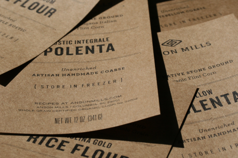
Anson Mills of Columbia, South Carolina, is unique in contemporary food culture: they specialize in cold milling organic heirloom grains—all of them dating from the antebellum South and bred exclusively for flavor. They are zealously committed to regional authenticity and, as a result, have garnered a devoted following among America’s best chefs.

Grain is life: our logo is derived from the merging of the Hopi breath glyph with a stylized seed (the enclosed diamond). Our approach to Anson Mills’ packaging labels is similarly direct: the type-only design is flexible enough to accommodate twenty-eight separate products in varying sizes.

+ SHARE Tags Play : Work/Symbols/Typography

12 July, 2010

CCA Steve Reoutt Memorial Scholarship

plog_12.07.10

We had the pleasure of knowing and working with Steve Reoutt as his colleagues in the Graphic Design program at California College of the Arts for many years. (Steve was Angie’s first Graphic Design instructor at CCA in 1993.) Steve taught at the college for 41 years and retired in 2008, shortly before his death.

We have been working to permanently endow a scholarship in Steve Reoutt’s name and are thrilled to report that we have met our initial $25,000 goal. We are also proud to note that community support for this scholarship is broad: over 80 faculty members, alumni, family, and friends have contributed so far. As a result, the Steve Reoutt Scholarship will provide financial support to talented graphic design students in perpetuity.

Our commitment is ongoing, however, as the more funds we raise, the greater the number of students we can assist. If you knew Steve or attended the Graphic Design program at CCA, please consider joining us in this effort. (Photo by David Asari.)

Contribute to the CCA Steve Reoutt Scholarship.

+ SHARE Tags Play : School

14 June, 2010

Fox at Landor, 06.03.2010

plog_14.06.10

Courtney Reeser, Managing Director of Landor Associates in San Francisco, invited Mark to exhibit and speak about his work “at Landor.” The exhibit encompassed work from Design is Play and BlackDog, and included logos, identity systems, posters, book covers, prints from Mark’s Erotikon series and, for the first time, seven of Mark’s personal sketchbooks. Mark had the honor of being introduced by his friend and colleague Michael Schwab. (Photos by Michael Friel.)

Watch excerpts of Mark Fox’s conversation with Courtney Reeser:

Fox at Landor 1 (2:09)
On Michael Schwab, clubbing baby seals, and perfection as the default.

Fox at Landor 2 (1:49)
On the “filter” of the computer and the homogenization of design.

Fox at Landor 3 (3:37)
On teaching Graphic Design 1 and hand-inking.

+ SHARE Tags Play : School/Play : Work

3 June, 2010

Wired Magazine iPad App Iconography

plog_01.06.10

Wired Magazine asked us to develop two sets of icons for their groundbreaking iPad app which launched in May, 2010. We designed the app’s global user interface icons which function at a size of 20 × 20 pixels; we also created interactive icons to navigate this multisensory edition of Wired. (Interactive icons include Play Video, Play Audio, Swipe Left to Right, and 360° View.) The covers of the first two issues feature our Play Video icon.

Read an interview with Wired’s Scott Dadich by Joshua Gorchov from The Loud Cloud. Download Wired’s iPad app from Apple.

+ SHARE Tags Play : Work/Symbols

8 February, 2010

Play Press: TDC Typography 30

plog_08.02.10

Our hand-lettered identity for One Catering is featured in the 30th Annual of The Type Directors Club. Drawing from the flavors of eight distinct restaurants, One Catering is the E pluribus unum of Charlotte, North Carolina. Different numeral ones are grafted together to form an identity that is both singular—one—and diverse.

+ SHARE Tags Play : Press/Play : Work/Typography

Previous
Next

Tags

  • Recent Posts
  • Play : Work
  • Play : Press
  • Play : School
  • Agitprop
  • Symbols
  • Typography
  • Playmates
  • Favorites
  • Books
  • Book Reviews
  • Interviews
  • Articles
  • Archive

©2026 Design is Play. All Rights Reserved.