Design is Play

  • Work
    • Systems
      • March Pantry
      • CCA DLS X
      • El Pípila
      • Oriel Wines
      • Touchstone Climbing
      • Helix RE
      • Exalt App
      • Intel AppUp
      • Extole
      • CCA Craft Forward
      • Anson Mills
      • Washoe Grill
      • The Buckeye
      • Unhelpful Instructions
      • Design is Play
    • Trademarks
    • Icons
    • Books
      • Symbols
      • Dirty Baby
      • Richter 858
    • Covers
    • Posters
    • Process
  • Play
    • PLOG
      • Recent Posts
      • Play : Work
      • Play : Press
      • Play : School
      • Agitprop
      • Symbols
      • Typography
      • Playmates
      • Favorites
      • Archive
    • Publications
      • Books
      • Articles
    • Press
      • Book Reviews
      • Interviews
    • Shop
  • Meet
    • About Us
    • Clients
    • Awards
    • Contact Us

23 April, 2012

March Pantry Identity and Packaging System Application

March Pantry

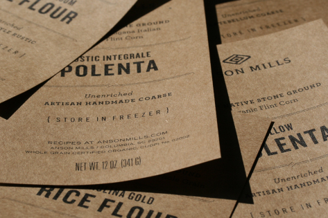
We recently completed a section on our site featuring our identity and packaging system for March Pantry. Hearth and home are central to the store’s concept, and the shop stocks seasonal jams made especially for March by LouLou’s Garden, select spices from Le Sanctuaire, pots and pans from Brooklyn Copper Cookware, and handmade butcher block tables from Union Studio.

Our hand-lettered wordmark is printed and embossed on die cut labels with a laid finish; it is screen printed when applied to apothecary jars. The design is understated but invitational. (So far the system has won awards for typography from both Communication Arts and the Type Directors Club.) Photographer Kirk Amyx documented the work.

See our work to date for March Pantry under Design is Play Studio Systems.

+ SHARE Tags Play : Work/Typography

5 March, 2012

Play Press: Graphis Logo 8

plog_05.03.12

Four mongrams and one icon system we created are included in the new logo design anthology curated by Graphis. Included are symbols for BlackDog, CCA’s Graphic Design BBQ, Four Barrel Coffee, and Group MB, as well as a system of icons we designed for Wired Magazine’s iPad app. The BlackDog monogram is a Platinum award winner, one of only ten.

The work of a number of our CCA colleagues is included in Graphis Logo Design 8 as well, including symbols designed by Jennifer Jerde and Scott Hesselink of Elixir Design, Christopher Simmons of Mine, and Michael Vanderbyl of Vanderbyl Design. This volume also features an interview with our friend—and Mark’s “boss” in 1985—Michael Schwab. Michael is one of the few designers we know of who still uses a Koh-I-Noor Rapidograph inking pen in the development of his final art.

See more examples of our trademark designs under Design is Play Studio Symbols.

+ SHARE Tags Play : Press/Symbols/Typography

9 January, 2012

Play Press: Communication Arts 2012 Typography Annual

plog_09.01.12

We are pleased to note that our March Pantry Packaging System is featured in Communication Arts 2012 Typography Annual. Of the 1,723 competition entries, 150 were selected for publication by the jury.

Check back soon for the complete March Pantry project in our Studio Systems section.

+ SHARE Tags Play : Press/Typography

21 November, 2011

Studio Climbing Identity

plog_21.11.11

Touchstone Climbing is opening yet another gym, this time in downtown San Jose, California. Located in a former movie theater called Studio, the building features a classic 1950 channel lettering neon sign. As part of our visual research, we took photographs of the signage while atop an electric scissor lift 30 feet above the street so we could capture the images without distortion. These photographs ultimately became the basis of hand-inked studies with which we created custom lettering.

The eye and gear symbol we designed references the history of the building as a theater, and is inspired by ideas of projection and seeing. The art was meticulously crafted to optically pulsate: it both radiates outward as it simultaneously contracts inward to the center. Noted speed climber Hans Florine summarizes the new Studio identity on Facebook with the phrase “I got my eye on your gear.”

+ SHARE Tags Play : Work/Symbols/Typography

14 November, 2011

Play at RE:DESIGN / Creative Directors, 11.07.2011 (part 2)

plog_14.11.11

“There is ecstasy in paying attention.” —Anne Lamott

Some of the interrelated themes we explored at the RE:DESIGN / Creative Directors conference earlier this month were notions of detail, craft, and tempo. In both our studio practice as well as in our classes at California College of the Arts, we strive to create and foster work that is the result of disciplined focus. Angie’s class, in particular, stresses attention to typographic detail.

In the act of reading, all of us are accustomed to seeing letters (and words) as discrete units of meaning; as a result, we are unaccustomed to paying attention to the nuanced details of individual letterforms. (And for good reason! Paying attention to these details impedes the process of reading.) Angie’s second assignment requires her students to create abstract compositions with the dissected forms and counterforms of letter anatomy. The nature of the assignment leads her students to focus on the very details of letterform design that are typically overlooked. These small, revelatory moments of seeing—fulfillments of Josef Albers’ teaching dictum “I want the eyes to open”—are essential to the development of any competent designer.

The images above show Jeff Lin at work and a finished composition by Constance Smith, two students in Angie’s Fall, 2011 class. See more examples of abstract typographic compositions under Design is Play Classroom Letters.

+ SHARE Tags Play : Press/Play : School/Typography

7 November, 2011

March Trunk Show Invitation

plog_07.11.11

Our friends at March asked us to design an invitation to a trunk show of apparel conceived by interior designer Sam Hamilton of March and textile and clothing designer Matt Dick of Mato Creative. Inspired by a mid-century photograph of a newspaper seller wearing a white paper apron with oversize headlines (i.e. “Football Results”), the invitation is screen printed on Tyvek. Matt transformed the flat piece into an apron by adding metal grommets and cotton ties, and then folding it.

Our original intention was to hand set the invitation text with xeroxes of hot metal type from an old Linotype specimen book, pasting it up one letter at a time. As sometimes happens, though, March fell in love with Angie’s rough sketch, and this became the basis of the final art. (The rough sketch is 3 1/2 inches wide—we enlarged it 1000% to the final width of 35 inches.) We like the contrast between the warmth and imprecision of Angie’s hand-traced type and the machined quality of Tyvek.

+ SHARE Tags Play : Work/Typography

24 October, 2011

Play Press: Typography Sketchbooks

Design is Play - Typography Sketchbooks Heller

We are pleased to be among the designers whose work is featured in Steven Heller’slatest book published by Princeton Architectural Press. Co-authored with Lita Talarico,Typography Sketchbooks reproduces the private sketchbook pages and working drawings of more than ninety of the world’s leading designers and typographers, including our CCA colleagues Bob Aufuldish of Aufuldish & Warinner, and Rod Cavazos of PsyOps.

Erratum department: Angie’s typographic explorations of the Design is Play identity are included in Typography Sketchbooks as well, but she is unfortunately not credited. The iterations of play generated by slicing up xeroxed copies of 15th century blackletters are hers…

+ SHARE Tags Play : Press/Typography

19 September, 2011

March Pantry Identity and Packaging System

MFox_ 068

We recently designed an identity and packaging system for March Pantry in San Francisco, a new venture from retail store March. Mark created the original identity for March in 2003, one year after Tobias Frere-Jones’ Gotham became available to the public. Eight years later, Gotham has become so ubiquitous as to be invisible; as a result, we needed to create an identity for March Pantry that related to March’s use of Gotham Light, but that varied enough to be distinctive.

The ensuing type treatment is built on Gotham’s bones, but it deviates in significant ways. Foremost among the changes: we eliminated variations in stroke weight, redrawing the letters as monoline forms. In addition, we gave the leg of the R a modest lilt, and we rounded all of the external corners and terminals to soften the typographic “voice.” Finally, the implied geometry (and symmetry) of the original are fully realized: the letter C is based on a perfect circle, and the M is absolutely symmetrical. The net effect, in some sense, is to “de-design” the face, returning it to its vernacular roots. At least that’s how we think of it.

The tactility of embossed lettering on the printed label—as well as Angie’s handwriting—provides a warm contrast to the set type. Offset lithography and registered embossing by Oscar Printing; photography by Kirk Amyx. We will show more applications in due course….

+ SHARE Tags Play : Work/Typography

29 August, 2011

New Work: Cengage Learning Book Covers

plog_29.08.11

We recently updated the section on our site featuring textbook covers we designed for Cengage Learning. Covers in this genre tend toward the literal, and rely heavily on stock photography. We aim to be metaphorical in our design approach, and to author our own images whenever possible. Each cover in this section features original photography, iconography, or typography.

See more examples of recent cover designs for Cengage Learning under Design is Play Studio Covers.

+ SHARE Tags Play : Work/Typography

21 March, 2011

MetalMark Naming and Identity

plog_21.03.11

Touchstone Climbing is opening a gym in Fresno, California, and we were asked to develop its name and visual identity. We named the new gym MetalMark after a native California butterfly with distinctive, metallic markings. We were inspired by the simple idea of metamorphosis, by the physical and mental changes we undergo as rock climbers. The form of our butterfly symbol is transformed as well: it is modeled on the engineered aluminum cams used in outdoor rock climbing.

The MetalMark logotype is set in Rockwell Antique, a slab serif typeface issued in 1931. As a cast-metal typeface, we like the connection between the materiality of the original type (metal) and the name MetalMark. The typeface is not available commercially, so we redrew the letters by hand before creating the art digitally.

+ SHARE Tags Play : Work/Symbols/Typography

14 March, 2011

Play at the Pasadena Museum of California Art

plog_14.03.11

Curator Amos Klausner charged twenty-six designers with re-imagining one letter from the alphabet, using the illegibility and deconstructive nature of graffiti as their starting point. (We chose the letter A.) The ensuing exhibition, Getting Upper, will open at the Pasadena Museum of California Art on May 15, 2011.

Our lowercase letter a is derived from Albrecht Dürer’s schema for blackletter construction published in 1538. Dürer’s line drawing breaks down the letter into component parts to reveal its design. We subvert this intent by reversing the diagram, flipping the negative spaces to positive ones. The resulting segments are then printed in a palette of modulated colors that further fragment (and deconstruct) the constructed letter. Our poster layout utilizes Jan Tschichold’s non-arbitrary page proportioning system to suggest a book page with the image area as the text block.

Each of the twenty-six letters will be published as a screen printed poster by Bloom Screen Printing Co. and made available for sale at the museum and online.

See more examples of our poster designs under Design is Play Studio Posters.

+ SHARE Tags Play : Press/Play : Work/Typography

21 February, 2011

20 Years Ago: Bomb the Pentagon

plog_21.02.11

For a 1991 AIGA San Francisco event, Steve Tolleson asked fifty Bay Area graphic designers to create posters addressing an environmental issue of their choice. My topic? The tendency of the US military to avoid environmental scrutiny—and, at times, responsibility—by invoking the so-called state secrets privilege. According to Project Censored, “the Department of Defense is the largest polluter in the world, producing more hazardous waste than the five largest US chemical companies combined. Depleted uranium, petroleum, oil, pesticides, defoliant agents such as Agent Orange, and lead, along with vast amounts of radiation from weaponry produced, tested, and used, are just some of the pollutants with which the US military is contaminating the environment.” The design parameters were tight: one color on a recycled stock at a size of 18 x 24. A number of the posters went on to win awards in national competitions, including my poster and those designed by Doug Akagi and Michael Schwab.

I hand-inked the arrows, target, and Bomb lettering, and built the constructivist-inspired typography with an early version of Adobe Illustrator. Final art was a black and white “stat” from which the printer shot a Kodalith film positive; he then screen printed the design using black enamel ink on corrugated cardboard. For any designer who remembers the prevalence of bright white, cast-coated papers such as Kromecote in the 1980s, printing “high end” work on an unbleached and uncoated substrate was unorthodox.

Twenty years later, given our post-Timothy McVeigh, post-9/11 mind-set, Bomb the Pentagon has become both visually and politically jarring: a year or so ago I watched a young museum curator’s body literally recoil from the poster. 1991 was a moment in American history that now seems strangely distant, when calls to bomb anything were rightly understood as hyperbole. Unlike much graphic design which is subject to visual trends, the “look” of this poster doesn’t appear dated, at least to my eyes; rather, it is the message—and its stridency—that dates the piece. [MF]

+ SHARE Tags Symbols/Typography/Agitprop

2 February, 2011

Play at Play

plog_02.02.11

To announce the launch of the Design is Play website, we created a mailing based on the idea of play. Playing card backs are overprinted with an LCD grid to suggest infinite possibilities: depending on which portions of the grid are “lit,” any letter or number can be constructed. The LCD grid as a programmable system is an apt analogy for our studio as well as the web.

Card fronts are overprinted with a “window” which both frames and reframes the original design, forcing the viewer to reconsider the familiar schema. Like the LCD grid, the window suggests a larger idea: a screen with an infinite number of views. The playing cards were foil stamped by Oscar Printing, San Francisco. (Photos by Mark Serr.)

See more playing cards under Design is Play Studio Systems.

+ SHARE Tags Play : Work/Typography

24 January, 2011

Minniti McMurtrie Identity

plog_24.01.11

We designed this identity for San Francisco fashion designer Jennifer Minniti and architect Darren McMurtrie. The letterforms are modeled on Banjo, a titling face released by the French foundry Deberny & Peignot in 1930. The wide versions of the letters provide cues to the pronunciation of their names as they roughly correspond to the stresses. (For example, the first R is held longer than the second R in McMurtrie.)

See more examples of our identity designs under Design is Play Studio Trademarks.

+ SHARE Tags Play : Work/Symbols/Typography

1 January, 2011

Man Ee Wong: As It Is Written: Project 304,805

poster_manee

For my Fall, 2010 Graphic Design 1 class at CCA, student Man Ee Wong designed this museum exhibit poster based on a show at the Contemporary Jewish Museum in San Francisco. As It Is Written: Project 304,805 is an exhibition featuring a specially trained scribe who writes the entire text of the Torah over the course of one year. The completed Torah is in the form of a scroll, and is comprised of 62 connected sheets on which are written 10,416 lines of text and 304,805 individual letters.

To design her poster Man Ee photographed a Torah at Congregation B’nai Emunah in San Francisco. (Thank you, Rabbi Melamut!) Man Ee is especially interested in the scroll’s physical seams, what might be thought of as the document’s “connective tissue.” As a result, her photograph is cropped to highlight a seam which bisects the poster on the right. Using a negative of the photographic image adds drama and challenges our preconceptions about how a Torah should be presented. In brief, she makes the Torah “new.”

Concurrent with her efforts in my class, Man Ee worked with Angie in Typography 1 and it is clear to me that the finished poster is a synthesis of Man Ee’s learning experiences in both classes. Man Ee recreates Theo Van Doesburg’s experimental alphabet of 1919 for the exhibition text and sets it in a justified block to echo the Torah’s justified columns of text. Van Doesburg’s letterforms provide a contrasting voice to the Hebrew: geometric versus organic; modern versus ancient; minimal versus complex. The placement of the colorful text block, bridging one of the Torah’s seams, suggests both reinforcement—a strengthening of tradition—as well as continuity. The Torah will live as long as it is read, and written. [MF]

See more examples of student poster design under Design is Play Classroom Posters.

+ SHARE Tags Play : School/Typography

20 December, 2010

Happy Holidays from our Junior Design Team!

plog_13.12.10

Lukas (6), Cate (9), and Elias (11) show off their kerning. Pax is Latin for peace.

+ SHARE Tags Typography/Favorites

6 September, 2010

Ward Schumaker at Play

plog_06.09.10

“While creating a piece of calligraphy for Afar Magazine, I’d cut a mask out of cardboard for the Swedish word lagom (meaning just enough, the opposite of excessive and extravagant), intending to use the mask as part of an elaborate Photoshop file combined with other images. When I turned to sweep the scraps from the floor, however, the afternoon sun was shining on them and they looked so genuine and honest, and somehow so appropriate, that I straightened them and photographed them just like that, and that’s how the piece appeared in the magazine. Very lagom.”

Ward Schumaker is a San Francisco artist. We invited him to share a moment of play with us.

+ SHARE Tags Typography/Playmates

23 August, 2010

Intel AppUp Center Identity

plog_23.08.10

We recently worked with Razorfish San Francisco to conceive a new identity for Intel’s AppUp center, a web initiative devoted to enhancing the functionality of Intel netbooks. Our identity features a star pattern and custom typography whose forms are based on the rounded square found in app icon silhouettes. The pattern is endlessly repeatable in a reference to the extensive range of apps available as well as to the idea of “cloud” computing.

+ SHARE Tags Play : Work/Symbols/Typography

9 August, 2010

Cengage Learning Book Cover

plog_09.08.10

We designed the cover for the latest edition of Concepts of Chemical Dependency, a text for undergraduate and graduate counseling classes. Prior cover designs for this title tended to be literal and almost encyclopedic in their attempt to illustrate myriad drugs. Our approach is metaphorical and minimal, and relies on our photograph of a single, iconic hook. The image is both seductive and dangerous, not unlike some addictive substances.

See more examples of recent cover designs for Cengage Learning under Design is Play Studio Covers.

+ SHARE Tags Play : Work/Symbols/Typography

19 July, 2010

Anson Mills Identity and Packaging System

plog_19.07.10

Anson Mills of Columbia, South Carolina, is unique in contemporary food culture: they specialize in cold milling organic heirloom grains—all of them dating from the antebellum South and bred exclusively for flavor. They are zealously committed to regional authenticity and, as a result, have garnered a devoted following among America’s best chefs.

Grain is life: our logo is derived from the merging of the Hopi breath glyph with a stylized seed (the enclosed diamond). Our approach to Anson Mills’ packaging labels is similarly direct: the type-only design is flexible enough to accommodate twenty-eight separate products in varying sizes.

+ SHARE Tags Play : Work/Symbols/Typography

Tags

  • Recent Posts
  • Play : Work
  • Play : Press
  • Play : School
  • Agitprop
  • Symbols
  • Typography
  • Playmates
  • Favorites
  • Books
  • Book Reviews
  • Interviews
  • Articles
  • Archive
Older
Newer

©2026 Design is Play. All Rights Reserved.