Design is Play

  • Work
    • Systems
      • March Pantry
      • CCA DLS X
      • El Pípila
      • Oriel Wines
      • Touchstone Climbing
      • Helix RE
      • Exalt App
      • Intel AppUp
      • Extole
      • CCA Craft Forward
      • Anson Mills
      • Washoe Grill
      • The Buckeye
      • Unhelpful Instructions
      • Design is Play
    • Trademarks
    • Icons
    • Books
      • Symbols
      • Dirty Baby
      • Richter 858
    • Covers
    • Posters
    • Process
  • Play
    • PLOG
      • Recent Posts
      • Play : Work
      • Play : Press
      • Play : School
      • Agitprop
      • Symbols
      • Typography
      • Playmates
      • Favorites
      • Archive
    • Publications
      • Books
      • Articles
    • Press
      • Book Reviews
      • Interviews
    • Shop
  • Meet
    • About Us
    • Clients
    • Awards
    • Contact Us

11 July, 2016

Berkeley Ironworks Identity

copyright_designisplay_plog_11_jul_2016

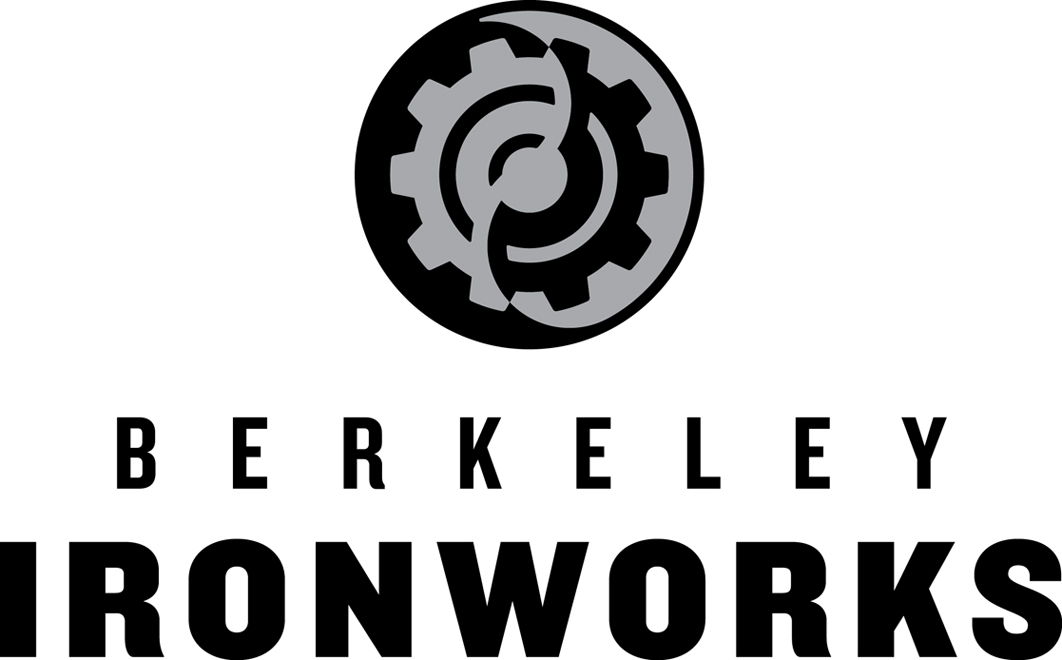
Our latest assignment from Touchstone Climbing was to redesign the identity for Berkeley Ironworks, the East Bay indoor climbing gym that opened in 2000. The gear is a reference to ironworks, of course—the gym’s original logo featured three gears—and the yin and yang design alludes to Berkeley’s reputation for alternative or non-conformist thinking.

The symbol was carefully inked to determine the relationships between the positive and negative forms; line weights were optically adjusted to ensure that the individual elements contributed to a balanced and harmonious whole.

+ SHARE Tags Play : Work/Symbols/Typography

6 June, 2016

Touchstone Brewing Co. Identity

copyright_designisplay_plog_6_jun_2016

We designed a distinctive T monogram within an eight-pointed star to identify the new Sacramento microbrewery Touchstone Brewing Co. The construction of the monogram is based on a series of nested squares: one for the T, and two for the eight-pointed star (with one square rotated 45°). The mildly explosive process of fermentation is suggested by the outwardly expanding star and the surrounding pattern of beer bubbles.

We look forward to sampling the product when the brewery launches. Cheers!

+ SHARE Tags Play : Work/Symbols/Typography

7 March, 2016

Sacramento Pipeworks / Pintworks Identities

copyright_designisplay_plog_7_mar_2016

Sacramento Pipeworks is a Northern California indoor rock climbing gym, with 40-foot walls and 11,000 square feet of climbing terrain. Originally opened by Touchstone Climbing in 2001, we were hired to redesign the gym identity.

Housed in a former pipeworks, the trademark is decidedly industrial, with a “machine shop” skull and crossbones. Our custom typography is a nod to the idea of pipes and the bending of pipes, and was inspired by a typeface lettered by German designer Max Körner in the late 1940’s.

Located next door to Pipeworks will be Pintworks, a taproom serving craft beers brewed by Touchstone Brewing Co. The Pintworks identity is a riff on Pipeworks, with a drop of beer replacing the nut over crossed wrenches.

+ SHARE Tags Play : Work/Symbols/Typography

30 November, 2015

Fox/BlackDog Acquired by LACMA, Part 2

copyright_designisplay_plog_30_nov_2015

In addition to the work from Design is Play mentioned in our last plog, the Los Angeles County Museum of Art acquired seven of Mark’s agitprop screen printed posters designed when he worked under the name BlackDog.

Works include “Elvis Ain’t King” (1992), about the Los Angeles Police Department Beating of Rodney King (above); “The Great Seal (after El Lissitsky)” (1998); “Cover Your Head” (1992); “howiloveya” (1998); “Tricky Ollie” (1998); “State of the Union (Where Friends Meet Friends)” (1998); and “End Pollution: Bomb the Pentagon” (1991). You can read about “End Pollution: Bomb the Pentagon” on our February 21, 2011 plog post.

See other agitprop posters at BlackDog.

+ SHARE Tags Play : Press/Play : Work/Symbols/Typography/Agitprop

23 November, 2015

Play Acquired by LACMA

copyright_designisplay_plog_23_nov_2015

Three posters and one postcard we designed in 2010 and 2011 were acquired by the Los Angeles County Museum of Art as part of their Decorative Arts and Design collection.

“Getting Upper” (left) is a screen printed poster we designed for an exhibition at the Pasadena Museum of California Art. Read about it on our March 14, 2011 plog post.

The “Craft Forward” (right) poster announces a symposium on craft at California College of the Arts in San Francisco and features a pattern based on the symposium identity we designed. Read about the identity on our January 5, 2011 plog post.

See other posters under Design is Play Studio Posters.

+ SHARE Tags Play : Press/Play : Work/Typography

17 August, 2015

Farmhouse Modern Wordmark

copyright_designisplay_plog_17_aug_2015

The wordmark we designed for Farmhouse Modern is based on the hot-metal typeface Hispalis Bold Titling. We don’t know who designed Hispalis or when it was originally released, but we assume it dates from the first half of the 20th century. Hispalis was issued by the Spanish foundry Nacional.

After inking several of the letters—the easier ones!—and rendering the forms in Adobe Illustrator, we worked with Rod Cavazos and his team at Psy/Ops to build out the final wordmark. Rod’s typographic expertise was much appreciated!

We think our revival of Hispalis embodies the dualities embodied by Farmhouse Modern: old vs. new, rural vs. urban, nature vs. design and, in some sense, female vs. male.

+ SHARE Tags Play : Work/Symbols/Typography

10 August, 2015

Farmhouse Modern Monogram

copyright_designisplay_plog_10_aug_2015

Farmhouse Modern is a website and quarterly magazine that celebrates a simple but refined aesthetic for the home. We developed both a wordmark and monogram—the latter specifically so that Farmhouse Modern can discreetly brand a range of custom products sold on its website.

The FM monogram we created is designed for maximum usability. Comprising only four disconnected lines, the mark is easily stenciled or sandblasted, as well as molded, embossed, embroidered, or printed. It also works well on-screen, and is legible at a size of less than 1/8″ in print.

+ SHARE Tags Play : Work/Symbols/Typography

8 June, 2015

Play Press: Becoming a Graphic and Digital Designer

plog_8_JUNE.2015

“Mark Fox: The Mark Maker,” an interview with Mark Fox in the Fifth Edition of Becoming a Graphic and Digital Designer by Steven Heller and Véronique Vienne, published by Wiley. Other featured designers and illustrators include Michael Bierut, Charles Spencer Anderson, Mirko Ilic, Steve Brodner, and CCA colleague Erik Adigard, among many others.

Not all of the original interview questions and answers are included in the book. The following excerpts may be of interest to students or those with a particular love of symbol design:

SH: How do you know when it is right?

When the idea is smart or original; when the forms are beautiful or well-crafted; when I like looking at it. When possible, I strive to create trademarks that don’t simply identify, but that pull the eye and hold it; that reward repeated viewings.

French designer Philippe Starck has said that “The first rule of design is to bring happiness.” Although Starck was speaking of his own work for Jean Paul Gaultier, I nevertheless think of this quote when I design. How do I know when it is right? When it brings me happiness.

A few of the marks that others have designed that I believe are “right” and that make me happy: Allianz Versicherungs (Karl Schulpig, 1923); Piet Zwart’s personal mark, 1928; Eveready Battery (unknown, c. 1930’s); Borzoi Books (Paul Rand, 1945); Railex (Woody Pirtle, 1984); Lone Star Donuts (Rex Peteet, 1985).

SH: Marks are not supposed to be too complicated, why not?

From a purely pragmatic perspective, simple marks are more easily reproducible in a variety of media and contexts. The demands of cheap offset printing on inferior substrates (such as newsprint) have been supplanted by the demands of the screen and a 32 x 32 pixel space. Although the primary medium for display may have changed, the underlying formal problem remains unchanged.

As I tell my students, the trick is to create a mark that is simultaneously simple but distinctive; that reproduces well in one color at less than half an inch, but that nonetheless pulls one’s eye and engages one’s mind. If one can solve this problem, one can use the mark anywhere.

SH: Did anyone, like Saul Bass, influence what and how you do what you do?

Saul Bass designed some striking posters and film sequences, but he was never one of my influences.

In the context of trademarks, my first significant influence was Michael Schwab. I became familiar with Michael’s work from my mom’s issues of “Communication Arts” which she subscribed to in the 1970’s. (My mom Eunice worked as a typesetter in a print shop when I was in high school.) Michael is a master of simplified (silhouetted) forms which he uses to design his distinctive posters and trademarks. I had the good fortune to work with Michael when I first moved to San Francisco in 1985, and his bold, stripped-down approach continues to resonate with me nearly thirty years later. (Michael, it should be noted, owes some of his success to two earlier designers who implicitly understood the power of the silhouette: Ludwig Hohlwein and Lucian Bernhard.)

Although I didn’t find a copy until perhaps 1986, Leslie Cabarga published the first of his A Treasury of German Trademarks in 1982 and it was a revelation: I felt like I suddenly gained the gift of sight. Karl Schulpig! My god. And Wilhelm Deffke of Wilhelmwerk: between 1915 and 1919 this German studio pioneered a reductivist approach to trademark design that proved to be decades ahead of its time, at least when compared with American trends. Wilhelmwerk’s forms are simple, compact, and unapologetically black. (Look up Deffke’s symbol for Eisenhand to see what I mean.) In the essay “A Mentor” reprinted in his 1993 book Design, Form and Chaos, Paul Rand cites both Karl Schulpig and Wilhelm Deffke as important influences, as well as others whose work I would eventually discover, among them: F.H. Ehmcke, O.H.W. Hadank, Max Körner, Fortunato Depero, and Hans Schleger (a.k.a. Zéro).

I believe that the best trademarks have a timeless quality, and so I am not embarrassed to admit that the designers whose work inspires me the most were at their prime nearly 100 years ago. My work and approach are rooted in a tradition of craft; the challenge, of course, is to harness this tradition while nonetheless creating work that has currency.

Download the interview as a PDF.

+ SHARE Tags Play : Press/Play : School/Symbols/Typography

4 May, 2015

Play Press: Communication Arts

plog_4_MAY_2015 Communication Arts May/June 2015 Cover

We are thrilled to be featured in Communication Arts’ May/June issue. The profile of Design is Play is written by Jessica Carew Kraft and includes a range of our work, including collaborations with former Credo Creative Director Steve Lyons and Los Angeles illustrator Greg Clarke.

We especially like the summary of the article on CA’s Table of Contents page: “A master of bold identity marks and a refined typography connoisseur marry talents in a dynamic San Francisco design partnership.” The marriage is metaphorical, of course, but it is romantic nonetheless.

Thank you to Patrick and Jean Coyne for this honor, and to Jessica for the article!

+ SHARE Tags Play : Press/Play : School/Symbols/Typography

24 November, 2014

Arcsine Identity

©DesignisPlay Arcsine Logo

The dimensional nature of this lowercase letter “a” monogram—comprising surface, volume, interior, and exterior—speaks to Arcsine’s comprehensive architectural practice. The subtext of this design is one of perception and, by extension, vision. The Arcsine wordmark is based on a face by Swiss designer Walter Käch and published in his book Schriften Lettering Ecritures in 1949.

The design of the Arcsine monogram came through an iterative sketching process. The form of the letter originates in the triskelion, an ancient “three-legged” glyph that symbolized progress and victory to the Greeks.

+ SHARE Tags Play : Work/Symbols/Typography

27 October, 2014

Mission Cliffs Applications

Mission Cliffs Applications

In his 1952 essay “On Trademarks,” Herbert Bayer refers to the trademark as a form of “pictorial stenography.” A good trademark is glyphic, and functions as visual shorthand for the client’s product or service. Our MC monogram for Mission Cliffs in San Francisco exemplifies this approach.

As I tell my students at CCA, the trick is to create a mark that is simultaneously simple but distinctive; that reproduces well in one color at less than half an inch, but that nonetheless pulls the eye and engages the mind. Here are two applications of the Mission Cliffs identity at extreme scales in size: lit signage above street level, and dumbbells.

A warm “thank you” to former student Sarah Devyani King for letting us use her photo of our signage! [MF]

+ SHARE Tags Play : Work/Symbols/Typography

18 August, 2014

Design is Play Archive

Justin Holbrook’s 2008 recontextualization of the classic fairytale Hansel and Gretel

Our original (non-responsive) Design is Play website is now accessible at designisplay/archive. This older site includes work from many of our former CCA students featured in projects from Angie’s Type 1 class and Mark’s Graphic Design 1 class. Student work can be found in the Classroom section of the site.

Pictured above are two spreads from Justin Holbrook’s 2008 recontextualization of the classic fairytale Hansel and Gretel.

+ SHARE Tags Play : School/Symbols/Typography

14 April, 2014

René Knip at CCA, 4.10.2014

plog_14_APR_2014

René at his Saturday workshop with CCA students, “The Architectural Letter.”

In town for the TYPO conference, we had the pleasure of bringing Dutch designer and typographer René Knip to California College of the Arts to give a lecture to CCA’s graphic design students and faculty. I had the honor of introducing René prior to his lecture; what follows are excerpts from my remarks:

René has a fierce love of typographic forms, and this love is most often expressed in a material—and spatial—context. In a 2011 interview, René said: “I use letters like a photographer does a camera: I use them to illustrate emotions.”

These emotions are evoked by a typography that is liberated from the page and screen and made manifest in the physical world. It joyfully inhabits this world, interacting with it: René’s letters move, cast shadows, get wet, and age. Whether formed of water cut steel, milled aluminum, sand-blasted stone, or ceramic tile, René consistently creates typography with a monumental presence that is nonetheless idiosyncratic and personal. His is a typography with a point of view.

René Knip studied graphic design at the Academy of Visual Arts St. Joost, Breda, where he worked under type designer Chris Brand, perhaps best known for the face Albertina. On graduation, Knip worked for three years as the assistant designer to Anthon Beeke. In 1992 he started his own studio, Atelier René Knip, or A.R.K.

In 2012 René launched the type foundry arktype.nl with Janno Hahn. Together they have released 25 typefaces specifically designed for use in architectural lettering and environmental graphics.

In an age in which graphic design is increasingly virtual and temporal, I take great pleasure in the work of a designer that is so concrete—and literally so. [MF]

+ SHARE Tags Play : School/Typography/Favorites

22 July, 2013

Play Press: Design Firms Open for Business

Design Firms Open for Business Book

We are pleased to be among the forty-four design firms interviewed for Steven Heller and Lita Talarico’s new book from Allworth Press. Although largely drawn from America—and, in particular, New York—the book is international in scope and includes designers from Australia, Canada, England, Germany, Israel, Italy, Japan, The Netherlands, Slovenia, South Korea, Spain, and Switzerland.

The other San Francisco designer included in Design Firms Open for Business is our CCA colleague Jennifer Morla. (Jennifer is in the “Medium Firms” section; as a two-person entity we qualify as “Small.”)

Download the interview as a PDF.

+ SHARE Tags Play : Press/Typography

1 July, 2013

In Memorium: Irving Oaklander, 1924–2012

(left) Irving Oaklander, proprietor of Oaklander Books in New York City, on December 23, 2010. Irving holds a rare copy of Vladimir Mayakovsky’s 1923 book For the Voice (Dlia Golosa) which was designed by El Lissitsky. (right) Angie holds a page of For the Voice up to the light to reveal the compositional correspondence between pages 17 and 18.

(left) Irving Oaklander, proprietor of Oaklander Books in New York City, on December 23, 2010. Irving holds a rare copy of Vladimir Mayakovsky’s 1923 book “For the Voice” (Dlia Golosa) which was designed by El Lissitsky. (right) Angie holds a page of “For the Voice” up to the light to reveal the compositional correspondence between pages 17 and 18.

Irving was curious and notably generous—two qualities that made him a natural teacher. (Not surprisingly, Irving taught in New York City’s public schools for many years before opening Oaklander Books.) Angie and I were fortunate to spend long hours on two separate occasions in his crowded Chelsea shop poring over his singular collection of design and typography books. Not only did Irving let us handle Mayakovsky’s For the Voice, but also, memorably, one of the Million Mark banknotes designed by Herbert Bayer in 1923.

Although Irving died one year ago this August, Angie and I think of him frequently, especially when Angie brings our type specimens to school to share with her students. Among the letterpress specimen books we bought from Irving are those for Trump-Deutsch (1938) designed by Georg Trump and released by H. Berthold, AG; Ingeborg Antiqua (c. 1909) designed by Professor F.W. Kleukens and released by D. Stempel, AG; and Ehmcke-Mediaeval (1924) designed by F.H. Ehmcke and released by D. Stempel, AG.

(left) A page from the Trump-Deutsch specimen book. (right) The title page from the Ingeborg Antiqua specimen book.

(left) A page from the Trump-Deutsch specimen book. (right) The title page from the Ingeborg Antiqua specimen book.

Steven Heller, who also frequented Oaklander Books, wrote a remembrance of Irving for Print Magazine in August of 2012 which can be read here. Swann Galleries in New York auctioned off some of Irving’s rare books in May of 2013, many of which can be seen in the auction catalog. Incidentally, Irving’s copy of For the Voice sold for $7,500. [MF]

+ SHARE Tags Typography/Favorites

10 June, 2013

Play Press: Design: Portfolio

Design: Portfolio

Two of our self-promotional pieces are included in this new book published by Rockport and authored by Craig Welsh. Design: Portfolio features our web announcement for the Design is Play site—foil stamped on playing cards by Frank La at Oscar Printing—and our 2010 New Year’s card—letterpress printed by Chip Forman, now at The Ligature.

Both of these projects can be seen at Design is Play Studio Systems.

+ SHARE Tags Play : Press/Typography

8 April, 2013

Beware of Dog: Embarko, Twenty-Four Years Later

Embarko

The San Francisco restaurant Embarko opened in 1989 when I was twenty-eight. Slated to be called Trudy’s after the owners’ dog, I was so uninspired by the name that I proposed multiple alternatives, Embarko among them. The new name referenced both the restaurant’s bayside location on the Embarcadero as well as the owners’ canine empathies.

The Embarko trademark takes the form of a rebus which requires the reader to decode conventional symbols of language—letters of the alphabet—in the company of a pictorial element representing sound. Inherently playful, the rebus is common to children’s puzzles but is less frequently found in trademarks. (One notable exception: Milton Glaser’s 1977 I♥NY.) An important development in the history of writing, the rebus is believed to have been invented by the Sumerians around 3000 BCE and subsequently adopted by the Egyptians.

My intention was to render the dog (which represents the onomatopoetic sound “bark”) as a glyph to visually approximate typography. I began by setting the letters E, M, and O in Raleigh Gothic Condensed, a geometric sans serif designed by M.F. Benton for the American Type Foundry (ATF) in 1932. By matching the stroke weights of the dog to those of the letterforms, the dog visually groups with and “reads” like the text. Happily, the dog’s “bark” also corresponds with the natural stress of the restaurant’s pronunciation: Em-bark-o.

The yellow Post-It note shows my original sketches for the trademark. I ultimately hand-inked the dog and rule with a Rapidograph technical pen; the type was set on a typositor by the San Francisco office of Andresen Typographics. Final art was a black and white “stat.”

My work for Embarko was selected for inclusion in the American Institute of Graphic Arts’ “Under 30” national competition in 1990. Some of the other young designers whose work was represented in “Under 30” includes Carol Devine Carson, Chip Kidd, and Alexander Isley. [MF]

See the Embarko rebus under Design is Play Studio Symbols Trademarks Food & Drink.

+ SHARE Tags Symbols/Typography

1 April, 2013

Cate and Lukas at Play: Puffoglyphs

A complete showing of the Puffoglyphs by Lukas, 2012.

A complete showing of the Puffoglyphs by Lukas, 2012.

Cate’s drawing examining the relationship between the “sacred” glyphs O, P and Q, 2012.

Cate’s drawing examining the relationship between the “sacred” glyphs O, P and Q, 2012.

Each of the twenty-six upper- and lowercase letters in our alphabet has a distinct structure, but all are comprised of only four elemental strokes: vertical, horizontal, diagonal, and curvilinear.

It was the Greeks who created this system of standardization approximately 3,500 years ago. In addition to imposing geometric order on the irregular letterforms they adopted from the Phoenicians, the Greeks established the use of a baseline and uniform letterspacing. (It would be another two millennia before the Frankish king Charlemagne mandated the adoption of three additional guidelines still in use today: ascenders, descenders, and a common x-height.)

As a natural extension of their play, our children Cate (age 11) and Lukas (age 8) created a code for their own use they call the Puffoglyphs. They intuitively broke down the Latin alphabet into its four stroke variants and then recombined the component parts to create new, “encoded” typographic forms.

“Elementary letterforms and signs composed of vertical, horizontal, slanted and curvilinear strokes.” Detail from Typography: Formation + Transformation by Willi Kunz.

“Elementary letterforms and signs composed of vertical, horizontal, slanted and curvilinear strokes.” Detail from Typography: Formation + Transformation by Willi Kunz.


American designer Willi Kunz explores the four elemental strokes in his 2003 Typography: Formation + Transformation. Of the illustration we feature from his book, Kunz notes that “Even though the individual forms are abstract, the forms begin to suggest a typographic composition.” The dynamic that Kunz articulates, Cate and Lukas experienced through an act of play. [AW]

+ SHARE Tags Typography/Favorites

25 March, 2013

Play Press: New Modernist Type

New Modernist Type

Two of our pieces are featured in Steven Heller’s latest book published by Thames & Hudson. Co-authored with Gail Anderson, New Modernist Type is an international showcase of contemporary graphic design that reinterprets the typographic tenets of Modernism. Perhaps not surprisingly, our work is included in the Meta Modern section which is subtitled “Typography as Icon and Symbol.” Our screen printed poster Getting Upper (see the 14 March, 2011 plog entry) is included, as well as the landing page image of the word “play” from our site, which was photographed by Annie Chen.

+ SHARE Tags Play : Press/Typography

11 March, 2013

Angie at Play

Angie Wang’s photographs (1:25)
Amsterdam, Paris, and St. Petersburg, 2004–2007.

Beauty is now underfoot wherever we take the trouble to look. —John Cage

Prior to a trip to Paris in 2004, Mark asked me to return with responses to the following prompts:
The best visual contrast;
The most beautiful piece of type;
The most lush color combination;
The most memorable bite (flavor);
A fifth sensation of note.

These images are the result of what has become an ongoing exercise in my paying attention. Whether with photographs, sketches, or journal entries, I’ve learned to document my travels in an active way because it heightens my awareness of what I see and experience.

Mark and I incorporated a version of this exercise into our 2007 summer study abroad class in Amsterdam. As we stated in our syllabus, “The act of seeing is made more acute by the act of recording.” [AW]

+ SHARE Tags Play : School/Typography/Favorites

Tags

  • Recent Posts
  • Play : Work
  • Play : Press
  • Play : School
  • Agitprop
  • Symbols
  • Typography
  • Playmates
  • Favorites
  • Books
  • Book Reviews
  • Interviews
  • Articles
  • Archive
Older
Newer

©2026 Design is Play. All Rights Reserved.