Design is Play

  • Work
    • Systems
      • March Pantry
      • CCA DLS X
      • El Pípila
      • Oriel Wines
      • Touchstone Climbing
      • Helix RE
      • Exalt App
      • Intel AppUp
      • Extole
      • CCA Craft Forward
      • Anson Mills
      • Washoe Grill
      • The Buckeye
      • Unhelpful Instructions
      • Design is Play
    • Trademarks
    • Icons
    • Books
      • Symbols
      • Dirty Baby
      • Richter 858
    • Covers
    • Posters
    • Process
  • Play
    • PLOG
      • Recent Posts
      • Play : Work
      • Play : Press
      • Play : School
      • Agitprop
      • Symbols
      • Typography
      • Playmates
      • Favorites
      • Archive
    • Publications
      • Books
      • Articles
    • Press
      • Book Reviews
      • Interviews
    • Shop
  • Meet
    • About Us
    • Clients
    • Awards
    • Contact Us

Recent Posts

5 January, 2011

CCA Craft Forward Symposium 2011 Identity

plog_05.01.11

Craft Forward is a forthcoming symposium at California College of the Arts that will explore the boundaries between craft, art, design, architecture, and writing. We were engaged to create the identity for the symposium and to design its promotional materials.

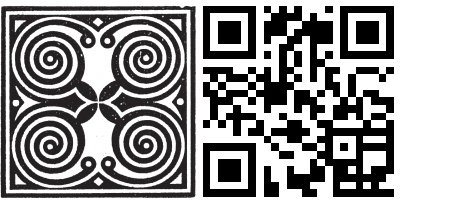
Our solution juxtaposes two square glyphs: a circa 1909 typographer’s ornament (symbolizing craft), and a QR code (symbolizing forward). The QR (or Quick Response) code can be scanned with a smart phone which then directs the user to the Craft Forward website. In this context the QR code functions as a modern ornament, but one with embedded content.

See the Craft Forward identity applied to a foil stamped postcard under Design is Play Studio Systems. (More applications to come….)

+ SHARE Tags Play : Work/Symbols

3 January, 2011

Play Press: Communication Arts 2011 Typography Annual

plog_03.01.11

We are pleased to announce that our studio website—yes, the one you are currently viewing!—as well as our 2010 New Year Card and Anson Mills Packaging System are featured in Communication Arts 2011 Typography Annual. Of the 2,135 competition entries, 179 were selected for publication by the jury.

+ SHARE Tags Play : Press

1 January, 2011

Man Ee Wong: As It Is Written: Project 304,805

poster_manee

For my Fall, 2010 Graphic Design 1 class at CCA, student Man Ee Wong designed this museum exhibit poster based on a show at the Contemporary Jewish Museum in San Francisco. As It Is Written: Project 304,805 is an exhibition featuring a specially trained scribe who writes the entire text of the Torah over the course of one year. The completed Torah is in the form of a scroll, and is comprised of 62 connected sheets on which are written 10,416 lines of text and 304,805 individual letters.

To design her poster Man Ee photographed a Torah at Congregation B’nai Emunah in San Francisco. (Thank you, Rabbi Melamut!) Man Ee is especially interested in the scroll’s physical seams, what might be thought of as the document’s “connective tissue.” As a result, her photograph is cropped to highlight a seam which bisects the poster on the right. Using a negative of the photographic image adds drama and challenges our preconceptions about how a Torah should be presented. In brief, she makes the Torah “new.”

Concurrent with her efforts in my class, Man Ee worked with Angie in Typography 1 and it is clear to me that the finished poster is a synthesis of Man Ee’s learning experiences in both classes. Man Ee recreates Theo Van Doesburg’s experimental alphabet of 1919 for the exhibition text and sets it in a justified block to echo the Torah’s justified columns of text. Van Doesburg’s letterforms provide a contrasting voice to the Hebrew: geometric versus organic; modern versus ancient; minimal versus complex. The placement of the colorful text block, bridging one of the Torah’s seams, suggests both reinforcement—a strengthening of tradition—as well as continuity. The Torah will live as long as it is read, and written. [MF]

See more examples of student poster design under Design is Play Classroom Posters.

+ SHARE Tags Play : School/Typography

27 December, 2010

Play Press: 50 Books/50 Covers of 2010

plog_27.12.10

Our design for the art book Dirty Baby is included in the AIGA exhibition “50 Books / 50 Covers of 2010.” The national competition features the best-designed books of the year, and we are happy to be among the winners. Dirty Baby showcases the paintings of American artist Ed Ruscha.

See several spreads from the project under Design is Play Studio Systems Dirty Baby.

+ SHARE Tags Play : Press

20 December, 2010

Happy Holidays from our Junior Design Team!

plog_13.12.10

Lukas (6), Cate (9), and Elias (11) show off their kerning. Pax is Latin for peace.

+ SHARE Tags Typography/Favorites

Previous
Next

Tags

  • Recent Posts
  • Play : Work
  • Play : Press
  • Play : School
  • Agitprop
  • Symbols
  • Typography
  • Playmates
  • Favorites
  • Books
  • Book Reviews
  • Interviews
  • Articles
  • Archive

©2026 Design is Play. All Rights Reserved.