
Our unauthorized campaign poster for Donald Trump is featured in “Who’s Behind that Anti-Trump Art?” on Co.Design by John Brownlee!
Our unauthorized campaign poster for Donald Trump is featured in “Who’s Behind that Anti-Trump Art?” on Co.Design by John Brownlee!
We are pleased to announce that The Monacelli Press is releasing our book Symbols: A Handbook for Seeing on November 8, 2016. This richly illustrated anthology includes more than 400 examples of ancient and contemporary art and design in a range of media, including architecture, film, industrial design, graphic design, illustration, and photography. Symbols documents and celebrates the many ways in which designers and artists have chosen to express symbolic ideas visually.
As graphic designers and instructors at California College of the Arts in San Francisco, we bring an informed, curatorial eye to the book’s content. British artist and craftsman William Morris implored the public to “Have nothing in your houses that you do not know to be useful, or believe to be beautiful.” If the book is understood as a kind of house, then we furnished Symbols: A Handbook for Seeing with useful and beautiful ideas and images.
Preview or pre-order from:
Amazon
Barnes and Noble
Also available from:
Kinokuniya in San Francisco
McNally Jackson in New York City
Museum of Contemporary Art Chicago Store

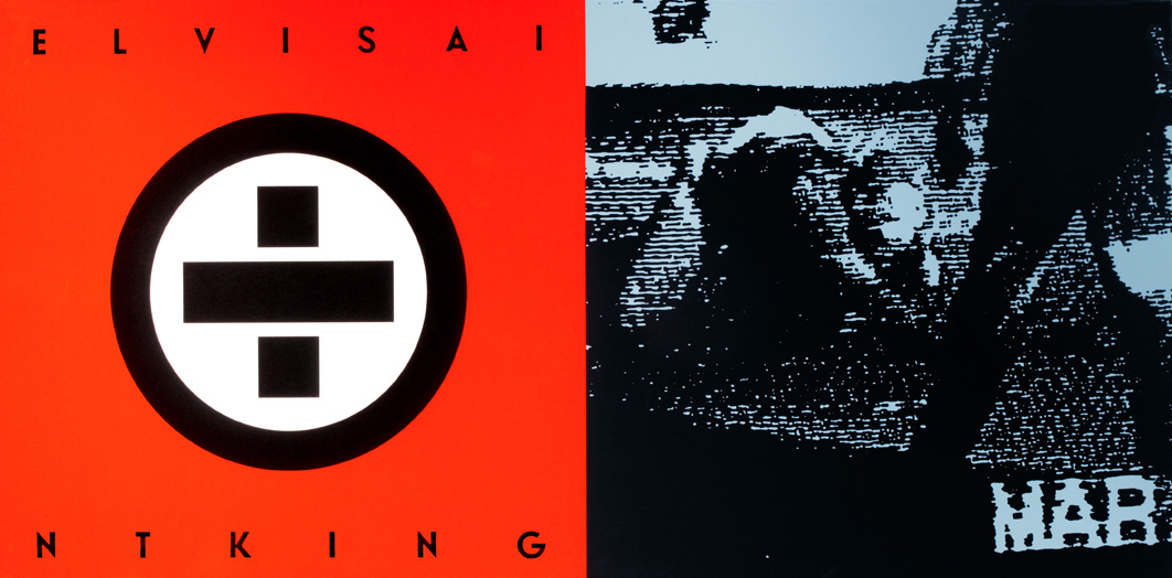
Inspired by Jesse Reed and Michael Bierut’s design of an official H monogram for Hillary Clinton’s presidential campaign, we created an unauthorized campaign poster for Donald J. Trump. Whereas Hillary’s H pulls one’s eye to the letterform itself, the narrative implicit in our design requires the viewer’s gaze to oscillate between foreground and background; between typographic form and counter-form.
The form comprises four gold, rotating letter Ts which are emblematic of qualities projected by Donald Trump and largely accepted by his supporters: strength, success, wealth, and revolutionary (i.e. impolitic) speech. The counter-form suggests a conflicting narrative, however: namely, that Donald Trump’s disruptive and divisive rhetoric is creating metaphoric negative spaces in the fabric of American society. These spaces—fracture lines, really—snake through the design’s square silhouette to reveal a swastika. And while the swastika is historically a symbol of dynamism and cyclical renewal associated with the sun, in this context it simply evokes hate speech and nationalist demagoguery.
Let’s be clear: for some Americans, the attractive aspects of Donald Trump’s public persona can obscure his repellent views. The tension in our design between positive and negative space—between luxe gold foil letters and the matte black swastika—is meant to mirror this dualism, and it is a tension that makes some uncomfortable. “How do I know it’s anti-Trump?” one wary hipster asked when we offered him our poster in the Chrome store on Valencia Street in San Francisco’s Mission District.
We hung some of our posters along several blocks of the Mission District that Saturday afternoon. Did anyone notice? In his 1966 book I manifesti, Italian designer Attilio Rossi records that “The poster is an optic scandal. You don’t want to look at it yet you see it.” We know that our scandalous Trump posters were indeed seen; only hours later, even the tape that held them in place was gone.
See our Trump 14K Gold-Plated and Trump 24K Gold-Plated poster and others under Design is Play Studio Posters.

Our FM monogram for Farmhouse Modern was published in Communication Arts’ 57th Design Annual. Of the 4,228 entries, 161 were selected for inclusion.
Farmhouse Modern is a website and quarterly magazine that celebrates a simple but refined aesthetic for the home.
See more of our Trademarks.

Touchstone Climbing owns and operates the most prestigious indoor climbing and bouldering gyms in California—and we are fortunate to have been working with them since 2010. The T monogram we designed is inspired by megalithic monuments such as the dolmens of Brittany or the taulas found on the Mediterranean island of Minorca: massive, stacked stones marking a place of importance in an often flat landscape.
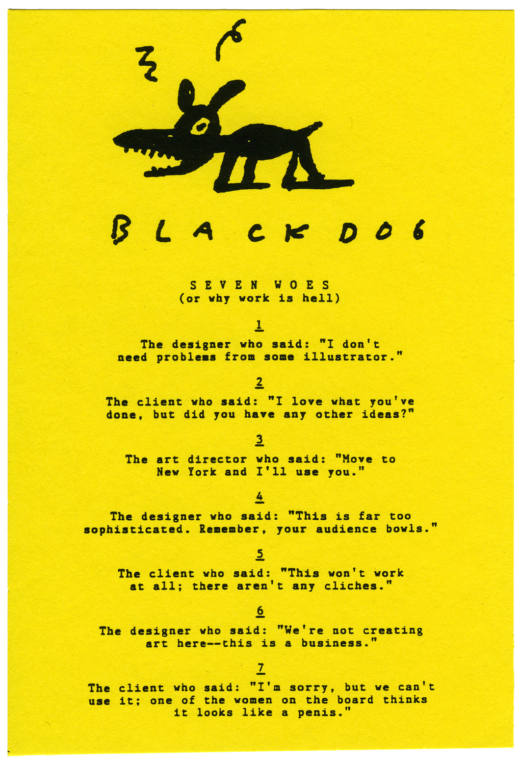
The theme of the 1989 AIGA Design Conference held in San Antonio, Texas, was “Dangerous Ideas.” As a mere conference attendee, Seven Woes was my attempt to share some dangerous design ideas with my fellow attendees. Cheaply xeroxed, I handed out the postcard-sized list randomly while awaiting the first speaker one morning.
The Seven Woes are:
1
The designer who said: “I don’t need problems from some illustrator.”
2
The client who said: “I love what you’ve done, but did you have any other ideas?”
3
The art director who said: “Move to New York and I’ll use you.”
4
The designer who said: “This is far too sophisticated. Remember, your audience bowls.”
5
The client who said: “This won’t work at all; there aren’t any clichés.”
6
The designer who said: “We’re not creating art here—this is a business.”
7
The client who said: “I’m sorry, but we can’t use it; one of the women on the board thinks it looks like a penis.”
All of the quotes on the card are real, and were directed to me. (The art director in quote no. 3 is none other than Steven Heller.) The variation of the BlackDog logo was drawn by Gary Baseman. (MF)
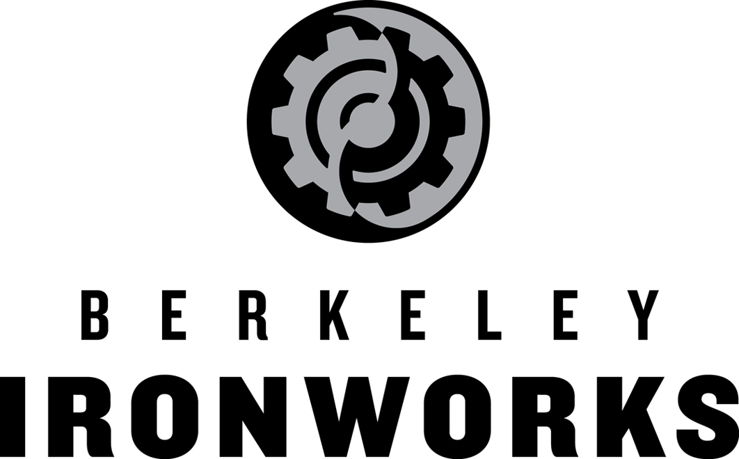
Our latest assignment from Touchstone Climbing was to redesign the identity for Berkeley Ironworks, the East Bay indoor climbing gym that opened in 2000. The gear is a reference to ironworks, of course—the gym’s original logo featured three gears—and the yin and yang design alludes to Berkeley’s reputation for alternative or non-conformist thinking.
The symbol was carefully inked to determine the relationships between the positive and negative forms; line weights were optically adjusted to ensure that the individual elements contributed to a balanced and harmonious whole.

We designed a distinctive T monogram within an eight-pointed star to identify the new Sacramento microbrewery Touchstone Brewing Co. The construction of the monogram is based on a series of nested squares: one for the T, and two for the eight-pointed star (with one square rotated 45°). The mildly explosive process of fermentation is suggested by the outwardly expanding star and the surrounding pattern of beer bubbles.
We look forward to sampling the product when the brewery launches. Cheers!
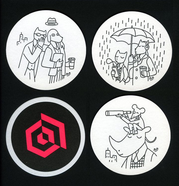
Three of a series of five letterpress coasters illustrated by our good friend Greg Clarke. Designed for our referral marketing client Extole, the coaster illustrations express the idea of “sharing.” Cheers!
Printed by The Ligature in Berkeley, California.
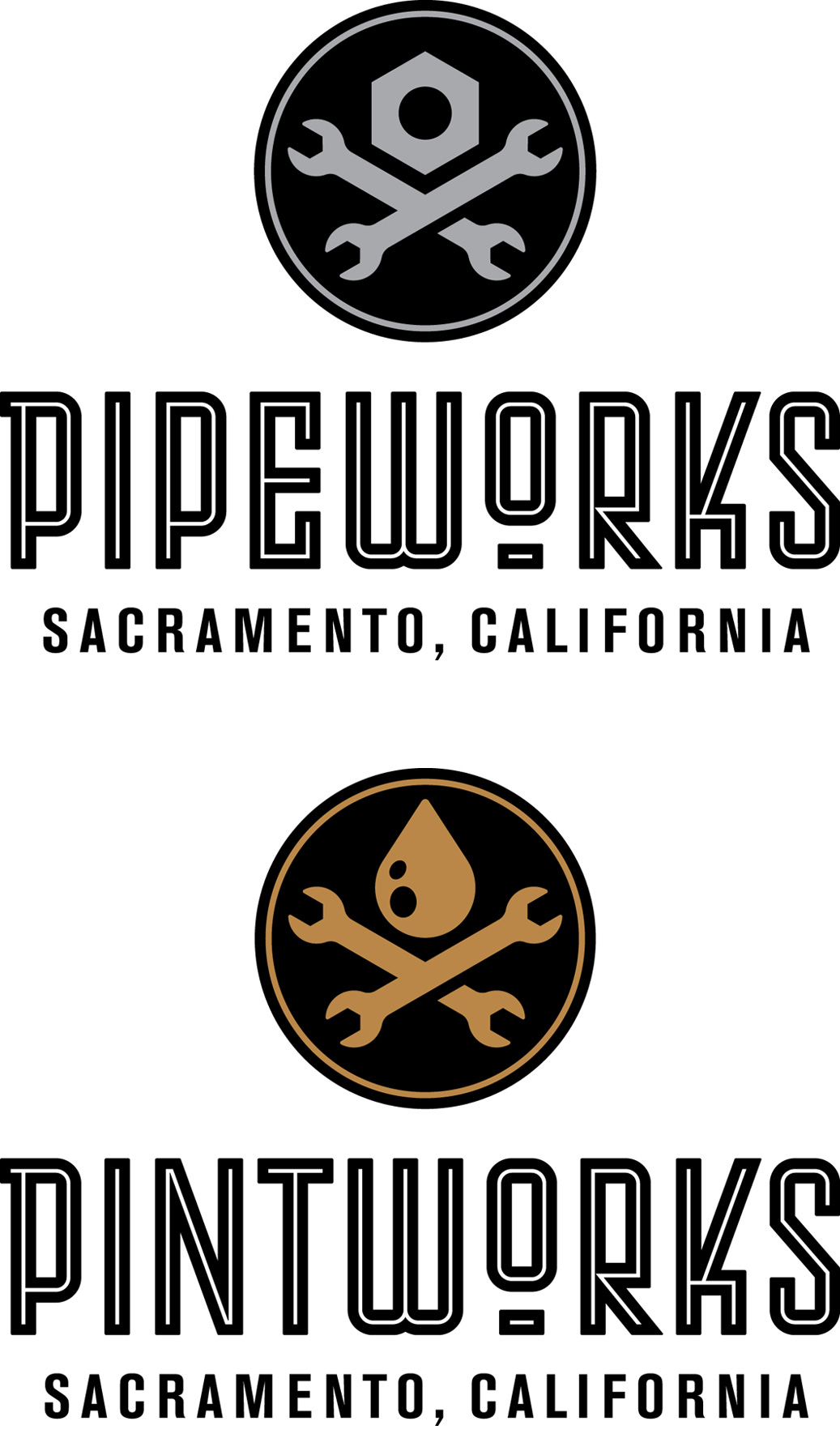
Sacramento Pipeworks is a Northern California indoor rock climbing gym, with 40-foot walls and 11,000 square feet of climbing terrain. Originally opened by Touchstone Climbing in 2001, we were hired to redesign the gym identity.
Housed in a former pipeworks, the trademark is decidedly industrial, with a “machine shop” skull and crossbones. Our custom typography is a nod to the idea of pipes and the bending of pipes, and was inspired by a typeface lettered by German designer Max Körner in the late 1940’s.
Located next door to Pipeworks will be Pintworks, a taproom serving craft beers brewed by Touchstone Brewing Co. The Pintworks identity is a riff on Pipeworks, with a drop of beer replacing the nut over crossed wrenches.

Our client Extole is a referral marketing company specializing in new customer acquisition for its clients. They recently moved their San Francisco office and asked us to propose a treatment for their lobby.
The men’s club vibe of their building on Sansome Street downtown is apparent in the marble and chandelier—which we decided to play against. We worked with Los Angeles illustrator Greg Clarke to create a series of Greco-Roman busts that are equal parts classical, modern (note the iPhone), and ridiculous (animal heads). Greg’s approach harmonizes with the formality of the architectural space while simultaneously creating a humorous (and therefore human) contrast.
Environmental photography by John Sutton.
In addition to the work from Design is Play mentioned in our last plog, the Los Angeles County Museum of Art acquired seven of Mark’s agitprop screen printed posters designed when he worked under the name BlackDog.
Works include “Elvis Ain’t King” (1992), about the Los Angeles Police Department Beating of Rodney King (above); “The Great Seal (after El Lissitsky)” (1998); “Cover Your Head” (1992); “howiloveya” (1998); “Tricky Ollie” (1998); “State of the Union (Where Friends Meet Friends)” (1998); and “End Pollution: Bomb the Pentagon” (1991). You can read about “End Pollution: Bomb the Pentagon” on our February 21, 2011 plog post.
See other agitprop posters at BlackDog.

Three posters and one postcard we designed in 2010 and 2011 were acquired by the Los Angeles County Museum of Art as part of their Decorative Arts and Design collection.
“Getting Upper” (left) is a screen printed poster we designed for an exhibition at the Pasadena Museum of California Art. Read about it on our March 14, 2011 plog post.
The “Craft Forward” (right) poster announces a symposium on craft at California College of the Arts in San Francisco and features a pattern based on the symposium identity we designed. Read about the identity on our January 5, 2011 plog post.
See other posters under Design is Play Studio Posters.
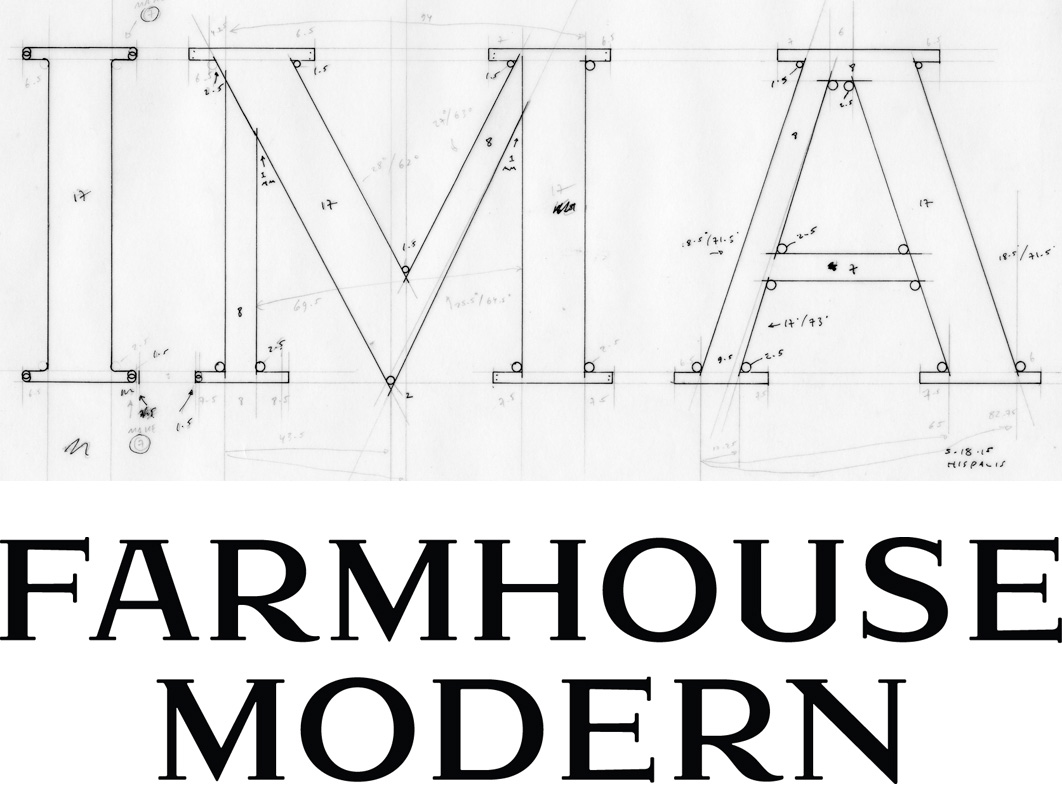
The wordmark we designed for Farmhouse Modern is based on the hot-metal typeface Hispalis Bold Titling. We don’t know who designed Hispalis or when it was originally released, but we assume it dates from the first half of the 20th century. Hispalis was issued by the Spanish foundry Nacional.
After inking several of the letters—the easier ones!—and rendering the forms in Adobe Illustrator, we worked with Rod Cavazos and his team at Psy/Ops to build out the final wordmark. Rod’s typographic expertise was much appreciated!
We think our revival of Hispalis embodies the dualities embodied by Farmhouse Modern: old vs. new, rural vs. urban, nature vs. design and, in some sense, female vs. male.

Farmhouse Modern is a website and quarterly magazine that celebrates a simple but refined aesthetic for the home. We developed both a wordmark and monogram—the latter specifically so that Farmhouse Modern can discreetly brand a range of custom products sold on its website.
The FM monogram we created is designed for maximum usability. Comprising only four disconnected lines, the mark is easily stenciled or sandblasted, as well as molded, embossed, embroidered, or printed. It also works well on-screen, and is legible at a size of less than 1/8″ in print.

DOWNLOAD
“Mark Fox: The Mark Maker”
by Steven Heller and Véronique Vienne
Becoming a Graphic & Digital Designer
Wiley, 2015

“Mark Fox: The Mark Maker,” an interview with Mark Fox in the Fifth Edition of Becoming a Graphic and Digital Designer by Steven Heller and Véronique Vienne, published by Wiley. Other featured designers and illustrators include Michael Bierut, Charles Spencer Anderson, Mirko Ilic, Steve Brodner, and CCA colleague Erik Adigard, among many others.
Not all of the original interview questions and answers are included in the book. The following excerpts may be of interest to students or those with a particular love of symbol design:
SH: How do you know when it is right?
When the idea is smart or original; when the forms are beautiful or well-crafted; when I like looking at it. When possible, I strive to create trademarks that don’t simply identify, but that pull the eye and hold it; that reward repeated viewings.
French designer Philippe Starck has said that “The first rule of design is to bring happiness.” Although Starck was speaking of his own work for Jean Paul Gaultier, I nevertheless think of this quote when I design. How do I know when it is right? When it brings me happiness.
A few of the marks that others have designed that I believe are “right” and that make me happy: Allianz Versicherungs (Karl Schulpig, 1923); Piet Zwart’s personal mark, 1928; Eveready Battery (unknown, c. 1930’s); Borzoi Books (Paul Rand, 1945); Railex (Woody Pirtle, 1984); Lone Star Donuts (Rex Peteet, 1985).
SH: Marks are not supposed to be too complicated, why not?
From a purely pragmatic perspective, simple marks are more easily reproducible in a variety of media and contexts. The demands of cheap offset printing on inferior substrates (such as newsprint) have been supplanted by the demands of the screen and a 32 x 32 pixel space. Although the primary medium for display may have changed, the underlying formal problem remains unchanged.
As I tell my students, the trick is to create a mark that is simultaneously simple but distinctive; that reproduces well in one color at less than half an inch, but that nonetheless pulls one’s eye and engages one’s mind. If one can solve this problem, one can use the mark anywhere.
SH: Did anyone, like Saul Bass, influence what and how you do what you do?
Saul Bass designed some striking posters and film sequences, but he was never one of my influences.
In the context of trademarks, my first significant influence was Michael Schwab. I became familiar with Michael’s work from my mom’s issues of “Communication Arts” which she subscribed to in the 1970’s. (My mom Eunice worked as a typesetter in a print shop when I was in high school.) Michael is a master of simplified (silhouetted) forms which he uses to design his distinctive posters and trademarks. I had the good fortune to work with Michael when I first moved to San Francisco in 1985, and his bold, stripped-down approach continues to resonate with me nearly thirty years later. (Michael, it should be noted, owes some of his success to two earlier designers who implicitly understood the power of the silhouette: Ludwig Hohlwein and Lucian Bernhard.)
Although I didn’t find a copy until perhaps 1986, Leslie Cabarga published the first of his A Treasury of German Trademarks in 1982 and it was a revelation: I felt like I suddenly gained the gift of sight. Karl Schulpig! My god. And Wilhelm Deffke of Wilhelmwerk: between 1915 and 1919 this German studio pioneered a reductivist approach to trademark design that proved to be decades ahead of its time, at least when compared with American trends. Wilhelmwerk’s forms are simple, compact, and unapologetically black. (Look up Deffke’s symbol for Eisenhand to see what I mean.) In the essay “A Mentor” reprinted in his 1993 book Design, Form and Chaos, Paul Rand cites both Karl Schulpig and Wilhelm Deffke as important influences, as well as others whose work I would eventually discover, among them: F.H. Ehmcke, O.H.W. Hadank, Max Körner, Fortunato Depero, and Hans Schleger (a.k.a. Zéro).
I believe that the best trademarks have a timeless quality, and so I am not embarrassed to admit that the designers whose work inspires me the most were at their prime nearly 100 years ago. My work and approach are rooted in a tradition of craft; the challenge, of course, is to harness this tradition while nonetheless creating work that has currency.
Download the interview as a PDF.

READ ONLINE | DOWNLOAD
“Design is Play”
by Jessica Carew Kraft
Communication Arts, May/June 2015

We are thrilled to be featured in Communication Arts’ May/June issue. The profile of Design is Play is written by Jessica Carew Kraft and includes a range of our work, including collaborations with former Credo Creative Director Steve Lyons and Los Angeles illustrator Greg Clarke.
We especially like the summary of the article on CA’s Table of Contents page: “A master of bold identity marks and a refined typography connoisseur marry talents in a dynamic San Francisco design partnership.” The marriage is metaphorical, of course, but it is romantic nonetheless.
Thank you to Patrick and Jean Coyne for this honor, and to Jessica for the article!

Hollywood Boulders is our latest collaboration with Touchstone Climbing in San Francisco. Slated to open later this year, Hollywood Boulders will be Southern California’s largest indoor bouldering gym, with 18-foot walls and 11,000 square feet of climbing terrain.
The geometry of the tri-skull symbol suggests both an urban skyline as well as the dihedral features of a rock wall. It’s also a nod to the Hollywood Forever Cemetery which just happens to be across the street from the gym.