Design is Play

  • Work
    • Systems
      • March Pantry
      • CCA DLS X
      • El Pípila
      • Oriel Wines
      • Touchstone Climbing
      • Helix RE
      • Exalt App
      • Intel AppUp
      • Extole
      • CCA Craft Forward
      • Anson Mills
      • Washoe Grill
      • The Buckeye
      • Unhelpful Instructions
      • Design is Play
    • Trademarks
    • Icons
    • Books
      • Symbols
      • Dirty Baby
      • Richter 858
    • Covers
    • Posters
    • Process
  • Play
    • PLOG
      • Recent Posts
      • Play : Work
      • Play : Press
      • Play : School
      • Agitprop
      • Symbols
      • Typography
      • Playmates
      • Favorites
      • Archive
    • Publications
      • Books
      • Articles
    • Press
      • Book Reviews
      • Interviews
    • Shop
  • Meet
    • About Us
    • Clients
    • Awards
    • Contact Us

7 March, 2016

Sacramento Pipeworks / Pintworks Identities

copyright_designisplay_plog_7_mar_2016

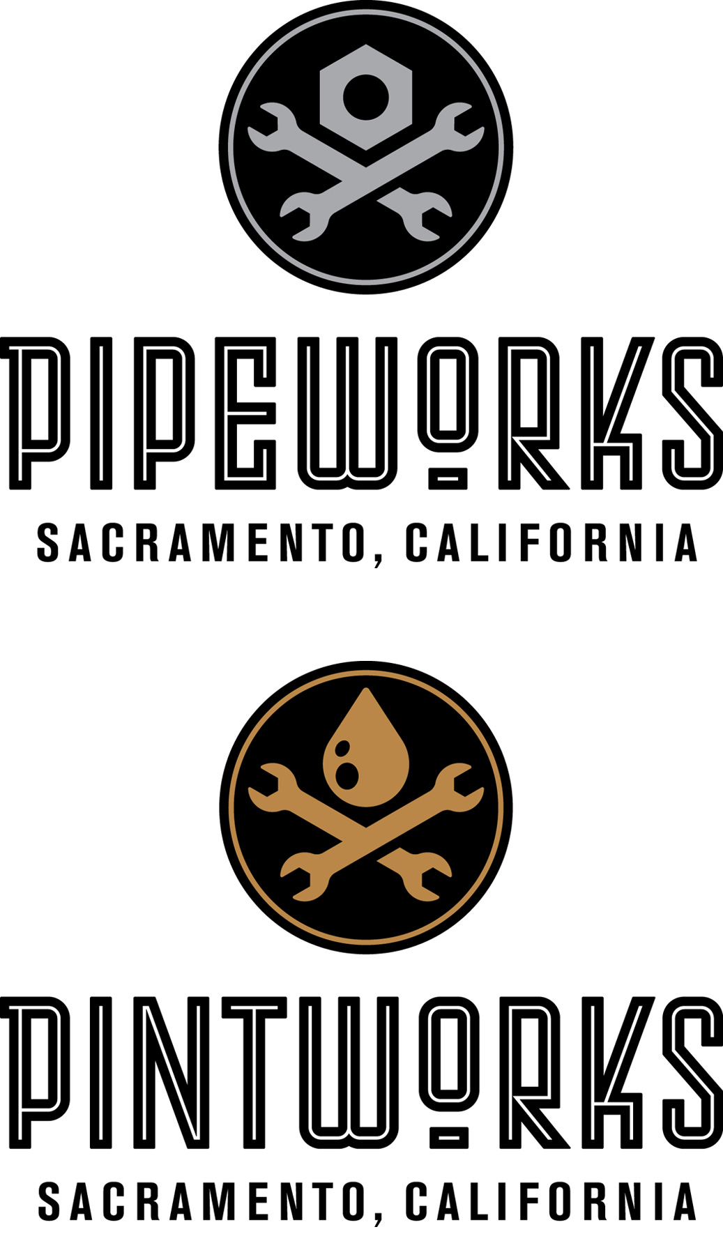
Sacramento Pipeworks is a Northern California indoor rock climbing gym, with 40-foot walls and 11,000 square feet of climbing terrain. Originally opened by Touchstone Climbing in 2001, we were hired to redesign the gym identity.

Housed in a former pipeworks, the trademark is decidedly industrial, with a “machine shop” skull and crossbones. Our custom typography is a nod to the idea of pipes and the bending of pipes, and was inspired by a typeface lettered by German designer Max Körner in the late 1940’s.

Located next door to Pipeworks will be Pintworks, a taproom serving craft beers brewed by Touchstone Brewing Co. The Pintworks identity is a riff on Pipeworks, with a drop of beer replacing the nut over crossed wrenches.

+ SHARE Tags Play : Work/Symbols/Typography

30 November, 2015

Fox/BlackDog Acquired by LACMA, Part 2

copyright_designisplay_plog_30_nov_2015

In addition to the work from Design is Play mentioned in our last plog, the Los Angeles County Museum of Art acquired seven of Mark’s agitprop screen printed posters designed when he worked under the name BlackDog.

Works include “Elvis Ain’t King” (1992), about the Los Angeles Police Department Beating of Rodney King (above); “The Great Seal (after El Lissitsky)” (1998); “Cover Your Head” (1992); “howiloveya” (1998); “Tricky Ollie” (1998); “State of the Union (Where Friends Meet Friends)” (1998); and “End Pollution: Bomb the Pentagon” (1991). You can read about “End Pollution: Bomb the Pentagon” on our February 21, 2011 plog post.

See other agitprop posters at BlackDog.

+ SHARE Tags Play : Press/Play : Work/Symbols/Typography/Agitprop

17 August, 2015

Farmhouse Modern Wordmark

copyright_designisplay_plog_17_aug_2015

The wordmark we designed for Farmhouse Modern is based on the hot-metal typeface Hispalis Bold Titling. We don’t know who designed Hispalis or when it was originally released, but we assume it dates from the first half of the 20th century. Hispalis was issued by the Spanish foundry Nacional.

After inking several of the letters—the easier ones!—and rendering the forms in Adobe Illustrator, we worked with Rod Cavazos and his team at Psy/Ops to build out the final wordmark. Rod’s typographic expertise was much appreciated!

We think our revival of Hispalis embodies the dualities embodied by Farmhouse Modern: old vs. new, rural vs. urban, nature vs. design and, in some sense, female vs. male.

+ SHARE Tags Play : Work/Symbols/Typography

10 August, 2015

Farmhouse Modern Monogram

copyright_designisplay_plog_10_aug_2015

Farmhouse Modern is a website and quarterly magazine that celebrates a simple but refined aesthetic for the home. We developed both a wordmark and monogram—the latter specifically so that Farmhouse Modern can discreetly brand a range of custom products sold on its website.

The FM monogram we created is designed for maximum usability. Comprising only four disconnected lines, the mark is easily stenciled or sandblasted, as well as molded, embossed, embroidered, or printed. It also works well on-screen, and is legible at a size of less than 1/8″ in print.

+ SHARE Tags Play : Work/Symbols/Typography

8 June, 2015

Play Press: Becoming a Graphic and Digital Designer

plog_8_JUNE.2015

“Mark Fox: The Mark Maker,” an interview with Mark Fox in the Fifth Edition of Becoming a Graphic and Digital Designer by Steven Heller and Véronique Vienne, published by Wiley. Other featured designers and illustrators include Michael Bierut, Charles Spencer Anderson, Mirko Ilic, Steve Brodner, and CCA colleague Erik Adigard, among many others.

Not all of the original interview questions and answers are included in the book. The following excerpts may be of interest to students or those with a particular love of symbol design:

SH: How do you know when it is right?

When the idea is smart or original; when the forms are beautiful or well-crafted; when I like looking at it. When possible, I strive to create trademarks that don’t simply identify, but that pull the eye and hold it; that reward repeated viewings.

French designer Philippe Starck has said that “The first rule of design is to bring happiness.” Although Starck was speaking of his own work for Jean Paul Gaultier, I nevertheless think of this quote when I design. How do I know when it is right? When it brings me happiness.

A few of the marks that others have designed that I believe are “right” and that make me happy: Allianz Versicherungs (Karl Schulpig, 1923); Piet Zwart’s personal mark, 1928; Eveready Battery (unknown, c. 1930’s); Borzoi Books (Paul Rand, 1945); Railex (Woody Pirtle, 1984); Lone Star Donuts (Rex Peteet, 1985).

SH: Marks are not supposed to be too complicated, why not?

From a purely pragmatic perspective, simple marks are more easily reproducible in a variety of media and contexts. The demands of cheap offset printing on inferior substrates (such as newsprint) have been supplanted by the demands of the screen and a 32 x 32 pixel space. Although the primary medium for display may have changed, the underlying formal problem remains unchanged.

As I tell my students, the trick is to create a mark that is simultaneously simple but distinctive; that reproduces well in one color at less than half an inch, but that nonetheless pulls one’s eye and engages one’s mind. If one can solve this problem, one can use the mark anywhere.

SH: Did anyone, like Saul Bass, influence what and how you do what you do?

Saul Bass designed some striking posters and film sequences, but he was never one of my influences.

In the context of trademarks, my first significant influence was Michael Schwab. I became familiar with Michael’s work from my mom’s issues of “Communication Arts” which she subscribed to in the 1970’s. (My mom Eunice worked as a typesetter in a print shop when I was in high school.) Michael is a master of simplified (silhouetted) forms which he uses to design his distinctive posters and trademarks. I had the good fortune to work with Michael when I first moved to San Francisco in 1985, and his bold, stripped-down approach continues to resonate with me nearly thirty years later. (Michael, it should be noted, owes some of his success to two earlier designers who implicitly understood the power of the silhouette: Ludwig Hohlwein and Lucian Bernhard.)

Although I didn’t find a copy until perhaps 1986, Leslie Cabarga published the first of his A Treasury of German Trademarks in 1982 and it was a revelation: I felt like I suddenly gained the gift of sight. Karl Schulpig! My god. And Wilhelm Deffke of Wilhelmwerk: between 1915 and 1919 this German studio pioneered a reductivist approach to trademark design that proved to be decades ahead of its time, at least when compared with American trends. Wilhelmwerk’s forms are simple, compact, and unapologetically black. (Look up Deffke’s symbol for Eisenhand to see what I mean.) In the essay “A Mentor” reprinted in his 1993 book Design, Form and Chaos, Paul Rand cites both Karl Schulpig and Wilhelm Deffke as important influences, as well as others whose work I would eventually discover, among them: F.H. Ehmcke, O.H.W. Hadank, Max Körner, Fortunato Depero, and Hans Schleger (a.k.a. Zéro).

I believe that the best trademarks have a timeless quality, and so I am not embarrassed to admit that the designers whose work inspires me the most were at their prime nearly 100 years ago. My work and approach are rooted in a tradition of craft; the challenge, of course, is to harness this tradition while nonetheless creating work that has currency.

Download the interview as a PDF.

+ SHARE Tags Play : Press/Play : School/Symbols/Typography

4 May, 2015

Play Press: Communication Arts

plog_4_MAY_2015 Communication Arts May/June 2015 Cover

We are thrilled to be featured in Communication Arts’ May/June issue. The profile of Design is Play is written by Jessica Carew Kraft and includes a range of our work, including collaborations with former Credo Creative Director Steve Lyons and Los Angeles illustrator Greg Clarke.

We especially like the summary of the article on CA’s Table of Contents page: “A master of bold identity marks and a refined typography connoisseur marry talents in a dynamic San Francisco design partnership.” The marriage is metaphorical, of course, but it is romantic nonetheless.

Thank you to Patrick and Jean Coyne for this honor, and to Jessica for the article!

+ SHARE Tags Play : Press/Play : School/Symbols/Typography

13 April, 2015

Hollywood Boulders Identity

©DesignisPlay Hollywood Boulders

Hollywood Boulders is our latest collaboration with Touchstone Climbing in San Francisco. Slated to open later this year, Hollywood Boulders will be Southern California’s largest indoor bouldering gym, with 18-foot walls and 11,000 square feet of climbing terrain.

The geometry of the tri-skull symbol suggests both an urban skyline as well as the dihedral features of a rock wall. It’s also a nod to the Hollywood Forever Cemetery which just happens to be across the street from the gym.

+ SHARE Tags Play : Work/Symbols

9 March, 2015

Fox/BlackDog Acquired by LACMA

©DesignisPlay Mark Fox Posters

Two posters Mark designed in the 1990’s were recently acquired by the Los Angeles County Museum of Art as part of the Marc Treib Collection. Treib is professor emeritus of architecture at the University of California, Berkeley, and his gift of over 500 posters now forms part of the Decorative Arts and Design collection at LACMA.

“5ive Iconoclasts” (left) is an offset litho poster promoting a series of lectures from the same year. The 1995 AIGA/SFMOMA Design Lecture Series featured an eclectic mix of designers and artists which included Tibor Kalman (M&Co.), Vaughan Oliver (v23), the Guerrilla Girls, Jenny Holzer, and Diller + Scofidio. The poster quotes Russian poet Vladimir Mayakovsky: “Art is not a mirror to reflect the world, but a hammer with which to shape it.”

“Republican Contract on America” (right) is a 1995 propaganda poster screen printed on chipboard. A quote by Nazi Hermann Göring is used to highlight the anti-intellectual, anti-cultural stance of the Republican-controlled 104th U.S. Congress.

See other agitprop posters at BlackDog.

+ SHARE Tags Play : Press/Symbols/Agitprop

9 February, 2015

Cliffs of Id Identity

©DesignisPlay Cliffs of ID

Cliffs of Id is a new climbing gym from Touchstone Climbing opening in Culver City, California. It is named after a passage in Reyner Banham’s Four Ecologies of Los Angeles, a book about Southern California and its architecture: “The Plains of Id are where the crudest urban lusts and most fundamental aspirations are created, manipulated and, with luck, satisfied.”

The Cliffs of Id symbol is a winged robot, an encapsulation of the mythic future as promised to America by the movie and television industries of Southern California in the 1950’s and 60’s. Like most of our trademark work, we inked this symbol by hand prior to rebuilding it in Illustrator. The wordmark is set in a 17 Oblong, an architectural typeface by Dutch designers René Knip and Janno Hahn at Arktype.

+ SHARE Tags Play : Work/Symbols

15 December, 2014

Odile Redon’s The Birth of Venus

The Birth of Venus

While researching the symbolism of the shell for our (ongoing!) book project, we stumbled on an intriguing visual juxtaposition we thought we would share.

The goddess of love emerges from a seashell in The Birth of Venus by French painter Odilon Redon, c. 1912. Originating in the ocean, the shell shares water’s associations with creation and procreation, genetrix and matrix. Combined with physical characteristics which can suggest female genitalia, the shell is an emblem of fecundity and life and, by extension, felicity and prosperity.

Redon’s rendering of the shell’s elliptical silhouette and luminous interior creates a nimbus-like effect similar to the mandorla found in religious icons of the Virgin Mary or the Christ. (The lunate rim of the shell also echoes the crescent moon on which the Virgin often sits or stands.) The detail on the left is from a 13th century Byzantine manuscript in the collection of the J. Paul Getty Museum, Los Angeles.

Like the early Christian almond-shaped aureole, Redon’s seashell is maternal womb, life, light, and utterly sacred. [MF]

+ SHARE Tags Play : Work/Symbols/Favorites

24 November, 2014

Arcsine Identity

©DesignisPlay Arcsine Logo

The dimensional nature of this lowercase letter “a” monogram—comprising surface, volume, interior, and exterior—speaks to Arcsine’s comprehensive architectural practice. The subtext of this design is one of perception and, by extension, vision. The Arcsine wordmark is based on a face by Swiss designer Walter Käch and published in his book Schriften Lettering Ecritures in 1949.

The design of the Arcsine monogram came through an iterative sketching process. The form of the letter originates in the triskelion, an ancient “three-legged” glyph that symbolized progress and victory to the Greeks.

+ SHARE Tags Play : Work/Symbols/Typography

27 October, 2014

Mission Cliffs Applications

Mission Cliffs Applications

In his 1952 essay “On Trademarks,” Herbert Bayer refers to the trademark as a form of “pictorial stenography.” A good trademark is glyphic, and functions as visual shorthand for the client’s product or service. Our MC monogram for Mission Cliffs in San Francisco exemplifies this approach.

As I tell my students at CCA, the trick is to create a mark that is simultaneously simple but distinctive; that reproduces well in one color at less than half an inch, but that nonetheless pulls the eye and engages the mind. Here are two applications of the Mission Cliffs identity at extreme scales in size: lit signage above street level, and dumbbells.

A warm “thank you” to former student Sarah Devyani King for letting us use her photo of our signage! [MF]

+ SHARE Tags Play : Work/Symbols/Typography

15 September, 2014

Mission Cliffs Monogram

Mission Cliffs

We are proud to have been given the opportunity to redesign the identity of our favorite climbing gym, Mission Cliffs in San Francisco. Housed in a former foundry, the gym has an urban, industrial feel: concrete floors, steel I-beams, and a massive crane hook with the hand painted legend “20 tons of capacity.”

We thought the identity should feel empathetic with the space and so relied on simple, constructed forms. (The MC monogram is the kind of no-nonsense trademark that could be stamped out of metal, or stenciled on a machine.) The hexagonal silhouette is a reference to the bolts that are used in both indoor and some outdoor climbing to fasten anchors to the wall; the arrow both reinforces the hexagon and suggests the idea of up!

Pictured with the final design is our second inking of the monogram which is around 5 3/4 inches wide.

+ SHARE Tags Play : Work/Symbols

18 August, 2014

Design is Play Archive

Justin Holbrook’s 2008 recontextualization of the classic fairytale Hansel and Gretel

Our original (non-responsive) Design is Play website is now accessible at designisplay/archive. This older site includes work from many of our former CCA students featured in projects from Angie’s Type 1 class and Mark’s Graphic Design 1 class. Student work can be found in the Classroom section of the site.

Pictured above are two spreads from Justin Holbrook’s 2008 recontextualization of the classic fairytale Hansel and Gretel.

+ SHARE Tags Play : School/Symbols/Typography

14 July, 2014

Play Press: Graphis Design Annual 2015

plog_14_JUL_2014

We are proud to note that our trademark for Dogpatch Boulders in San Francisco will be included in the forthcoming Graphis Design Annual 2015, “a collection of the year’s best work from top designers in the industry.” Our mark is a conceptual no-brainer: dog + “eyepatch” = Dogpatch. The colored X behind the dog was created with climbing tape, and reinforces the cruciform design of the dog’s face. In effect, we created a visual mnemonic for the gym.

Of the nine rock climbing gyms that our client owns, this design has proved to be the most popular with the public. They sell more shirts with the Dogpatch identity on it than any of their other gyms. Woof!

+ SHARE Tags Play : Press/Symbols

3 March, 2014

AIGA 100 Years of Design: 1914–2014

plog_03_MAR_ 2014

To celebrate the American Institute of Graphic Arts’ centennial, the AIGA asked 100 designers to create “a piece of artwork that makes a social, political or cultural statement about one year from AIGA’s history.” Mark chose the year 1958 so he could work with Gerald Holtom’s timeless symbol for Nuclear Disarmament—what would eventually become known as the “Peace Sign.” All 100 designs from the project can be seen on the AIGA site.

+ SHARE Tags Play : Work/Symbols

27 January, 2014

CREDO Mobile Iconography

plog_27_JAN_2014

Our friend and colleague Steve Lyons asked us to develop a series of political “issue” icons for CREDO Mobile, San Francisco’s progressive phone company. We are proud CREDO customers, so it was a delight to put our talents to work on behalf of our left-leaning phone carrier. Left to right, top to bottom: Women’s Rights, Universal Healthcare, Peace, Workers’ Rights, Social Justice, Renewable Energy, Economic Justice, Marriage Equality, Environment, Voting Rights, and Workers’ Rights (alternate version).

+ SHARE Tags Play : Work/Symbols

20 January, 2014

Play Press: Animal Logos

plog_20_JAN_2014

The latest book from Counter-Print Press (UK) includes four of our trademarks: Red Herring, The Buckeye, BO.LT, and Eveready Battery. This international collection of 266 animal logos features work from Total Identity, Lance Wyman, Build, Stockholm Design Lab, Minale Tattersfield, Stefan Kanchev, and Kari Piippo Oy, among others.

+ SHARE Tags Play : Press/Symbols

9 September, 2013

CCA Graphic Design Program Avatar

Not that CCA’s Graphic Design Program needed a Facebook avatar, but, what the hell. Here is Mark’s original inking for the surprisingly energetic skull, as well as CCA alumna Nami Kurita displaying the die-cut sticker version of the design on her iPhone. Design or Die!

+ SHARE Tags Play : School/Play : Work/Symbols

8 April, 2013

Beware of Dog: Embarko, Twenty-Four Years Later

Embarko

The San Francisco restaurant Embarko opened in 1989 when I was twenty-eight. Slated to be called Trudy’s after the owners’ dog, I was so uninspired by the name that I proposed multiple alternatives, Embarko among them. The new name referenced both the restaurant’s bayside location on the Embarcadero as well as the owners’ canine empathies.

The Embarko trademark takes the form of a rebus which requires the reader to decode conventional symbols of language—letters of the alphabet—in the company of a pictorial element representing sound. Inherently playful, the rebus is common to children’s puzzles but is less frequently found in trademarks. (One notable exception: Milton Glaser’s 1977 I♥NY.) An important development in the history of writing, the rebus is believed to have been invented by the Sumerians around 3000 BCE and subsequently adopted by the Egyptians.

My intention was to render the dog (which represents the onomatopoetic sound “bark”) as a glyph to visually approximate typography. I began by setting the letters E, M, and O in Raleigh Gothic Condensed, a geometric sans serif designed by M.F. Benton for the American Type Foundry (ATF) in 1932. By matching the stroke weights of the dog to those of the letterforms, the dog visually groups with and “reads” like the text. Happily, the dog’s “bark” also corresponds with the natural stress of the restaurant’s pronunciation: Em-bark-o.

The yellow Post-It note shows my original sketches for the trademark. I ultimately hand-inked the dog and rule with a Rapidograph technical pen; the type was set on a typositor by the San Francisco office of Andresen Typographics. Final art was a black and white “stat.”

My work for Embarko was selected for inclusion in the American Institute of Graphic Arts’ “Under 30” national competition in 1990. Some of the other young designers whose work was represented in “Under 30” includes Carol Devine Carson, Chip Kidd, and Alexander Isley. [MF]

See the Embarko rebus under Design is Play Studio Symbols Trademarks Food & Drink.

+ SHARE Tags Symbols/Typography

Tags

  • Recent Posts
  • Play : Work
  • Play : Press
  • Play : School
  • Agitprop
  • Symbols
  • Typography
  • Playmates
  • Favorites
  • Books
  • Book Reviews
  • Interviews
  • Articles
  • Archive
Older
Newer

©2026 Design is Play. All Rights Reserved.